JustAnswer
Redesigned the mobile dashboard for JustAnswer's 10M+ users — establishing a North Star mobile strategy, unifying web and native app experiences, and shipping an MVP that delivered measurable business impact within 2 months. +6% LTV35, +4% Retention, −11% Refund rate.
Problem
By 2022, mobile users on JustAnswer had grown to nearly 70% of the total user base — but the product had never been designed with mobile in mind.
The core issues we needed to solve:
- The mobile web and native app had been in use for over seven years with no significant redesign, and neither was optimized for mobile use.
- The two platforms were visually and functionally inconsistent, creating a fragmented experience for users who switched between them.
- The absence of a mobile-first approach was hurting retention and product stickiness — directly threatening our primary metrics, LTV and Retention.
Business objectives
Three goals shaped the scope of this project:
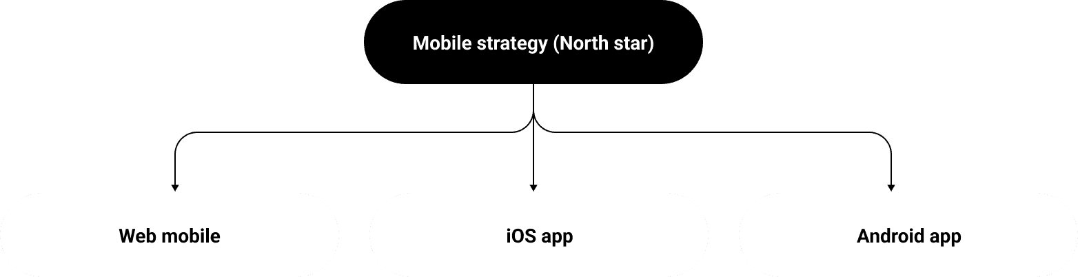
- Define a North Star mobile strategy applicable to both mobile web and native app, to serve as a long-term design direction across platforms.
- Redesign the mobile web dashboard to increase member confidence in the service and improve retention.
- Move primary metrics — specifically LTV35 and Retention.
Research
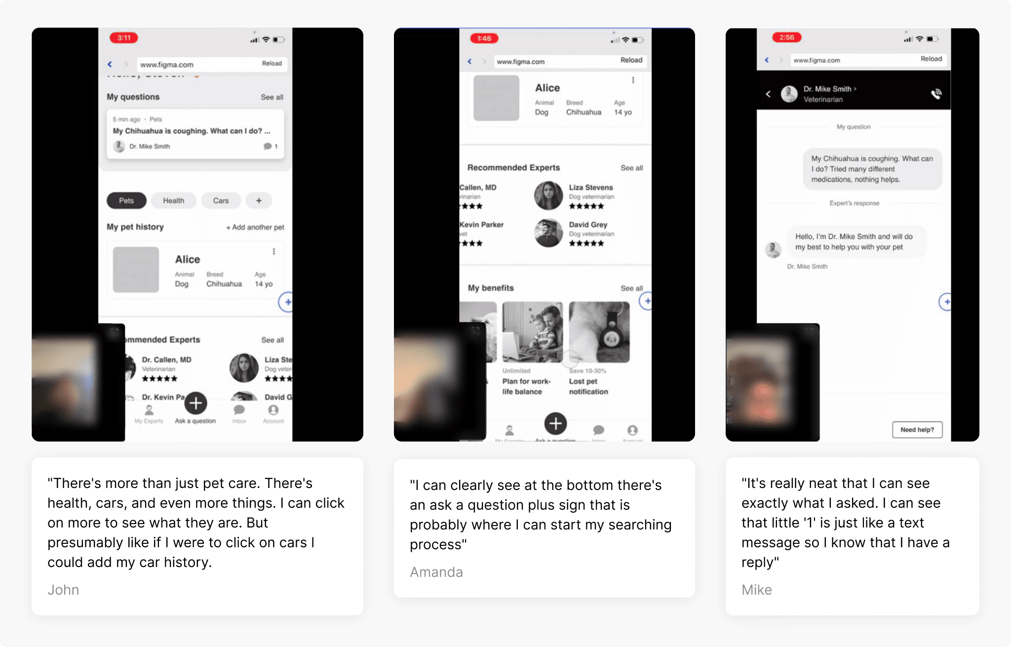
We ran 8 moderated user interviews and layered in heatmap and behavioral data to surface and validate the biggest pain points.
User interviews: Active customers who had submitted at least 2 questions in the past 3 months were given access to a test account and asked to navigate freely while thinking aloud.
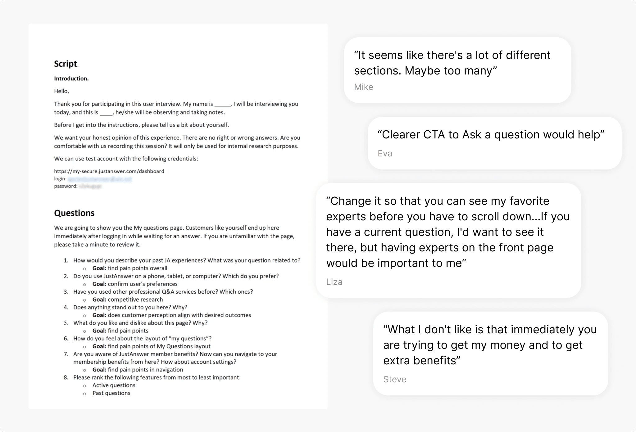
Quantitative layer: Heatmap analysis and behavioral data validated and prioritized patterns from the qualitative sessions.
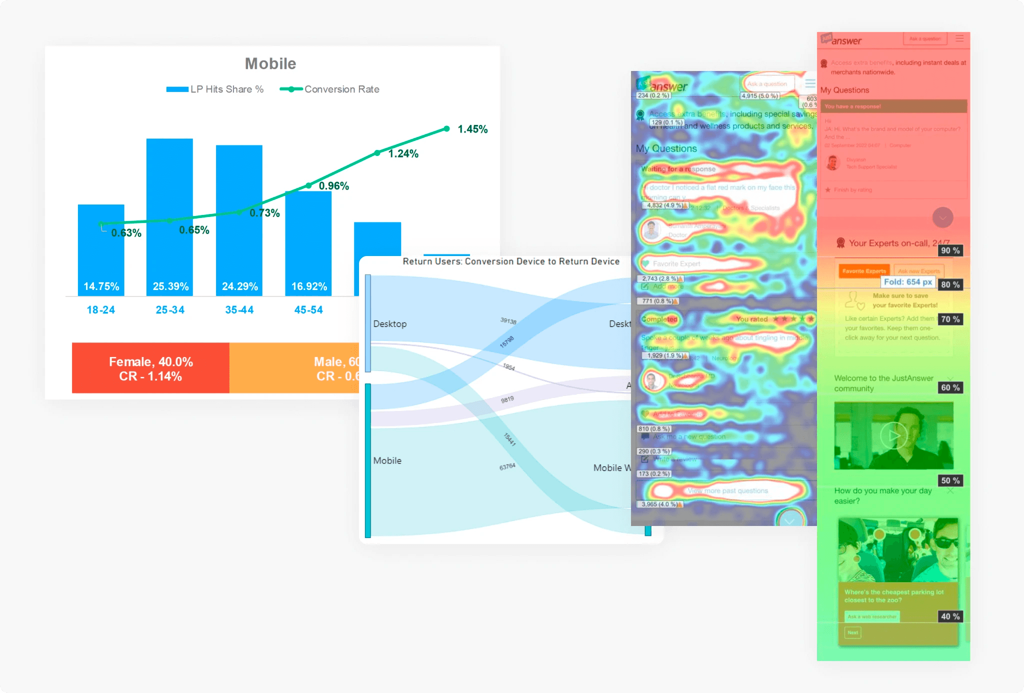
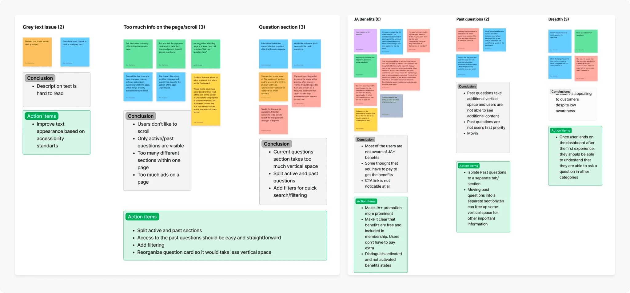
Key findings:
- Favorite Expert is a popular feature, but most users didn't know it existed.
- Navigation was confusing — users struggled to move between Home and My Benefits.
- The dashboard was too crowded, with too many competing CTAs.
- Question categories beyond the user's primary one had very low awareness.
- Past questions dominated above-the-fold space, despite being low on users' priority list.
- Most users stopped scrolling at "My questions" and never saw anything below it.
Mobile strategy
With user insights, business objectives, and stakeholder input aligned, we ran a series of cross-functional workshops with the PM, engineers, and design team to define what the new experience should look like.
The output was a set of low-fidelity wireframes mapping the full end-to-end mobile user journey — a shared, documented vision that became the foundation for all subsequent design work.
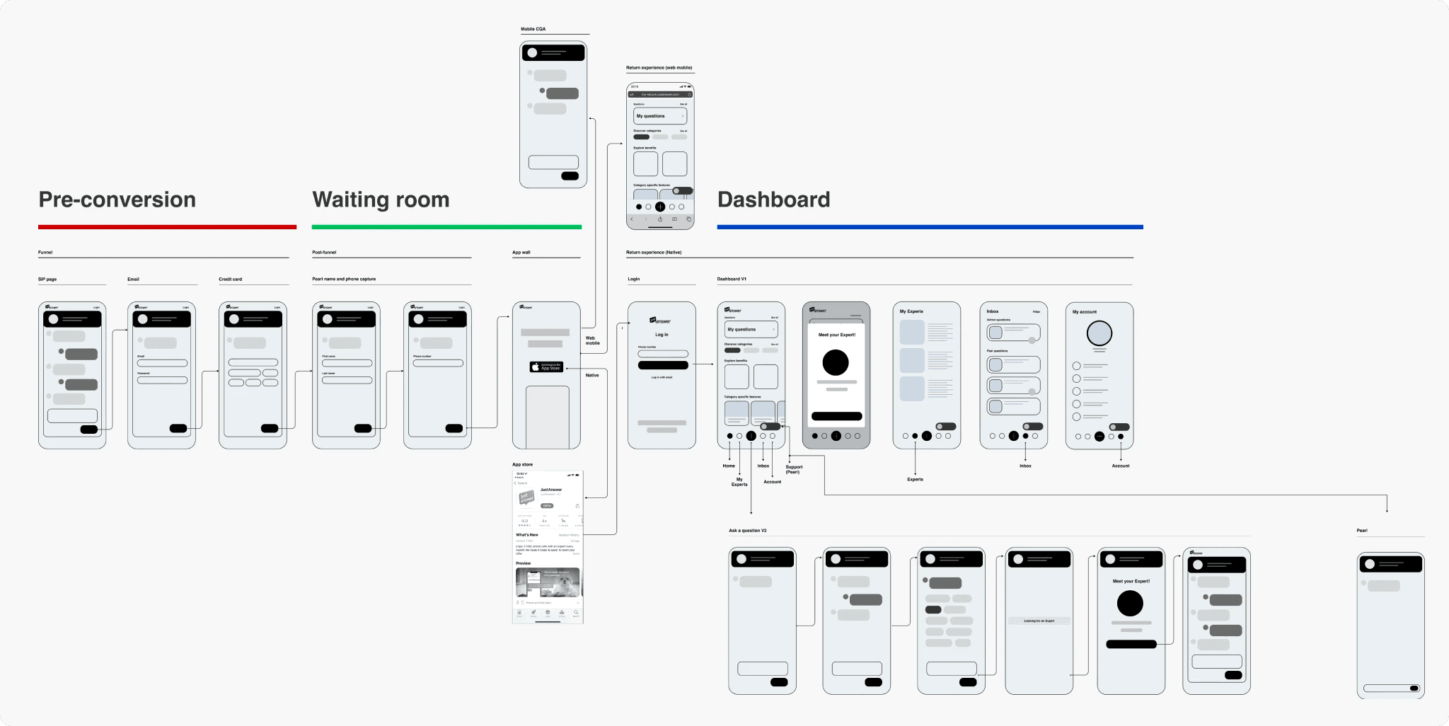
Wireframes & user testing
Our product had three distinct phases: Pre-conversion, Waiting room, and the customer Dashboard. This project focused exclusively on the dashboard — the experience after a user had already signed up and asked a question.
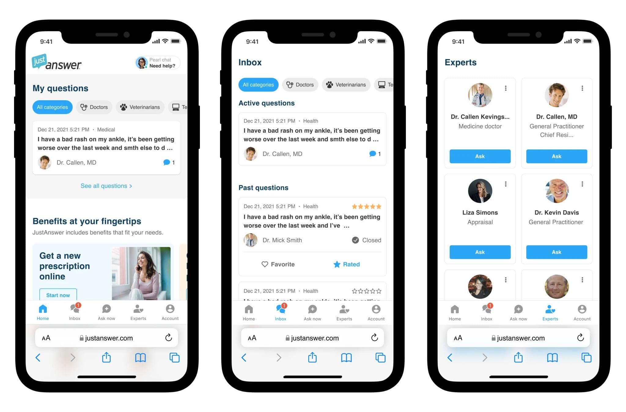
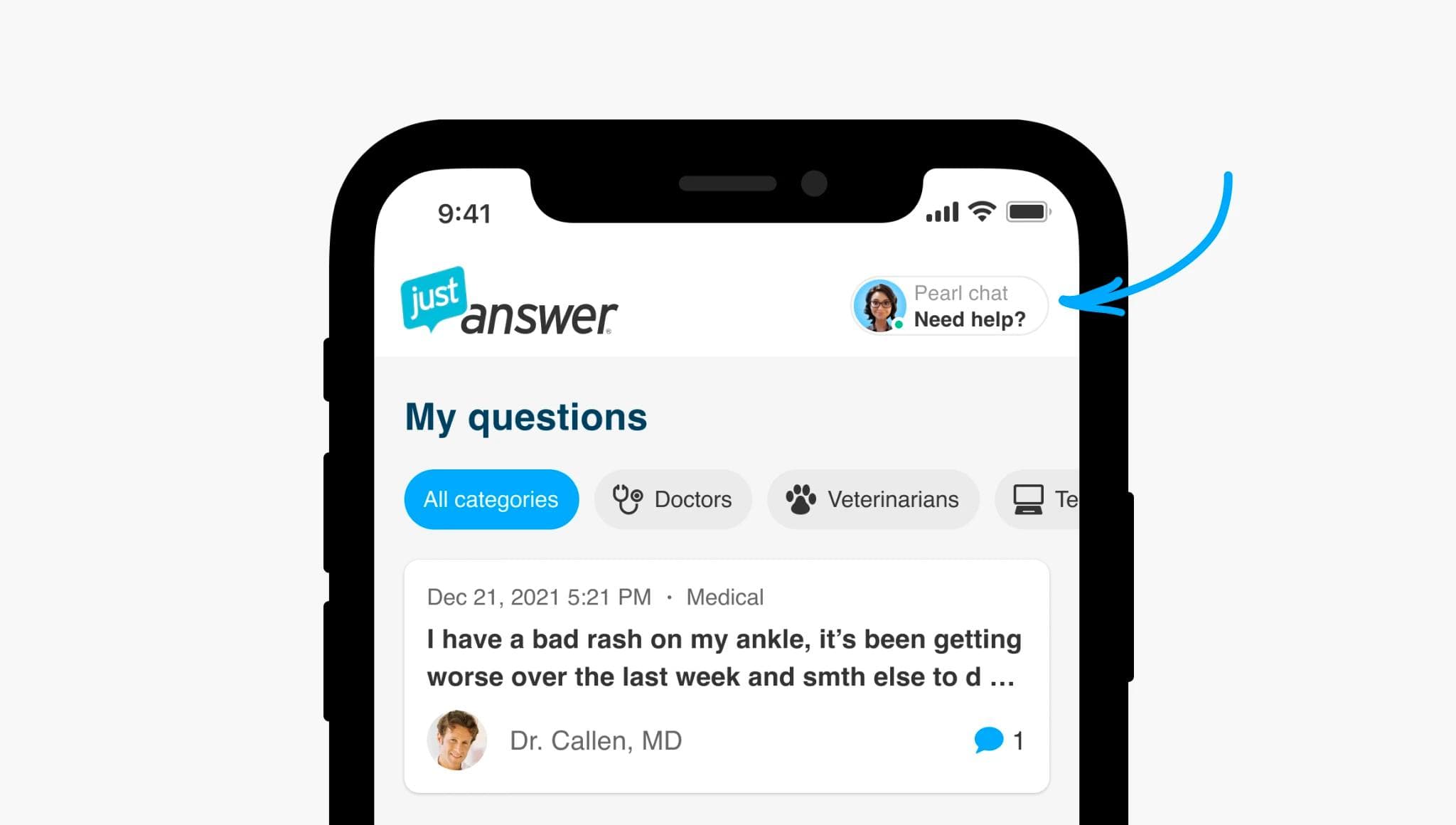
The biggest structural change was navigation. On mobile web, we deprecated the hamburger menu entirely and moved all key features into a bottom navigation bar. The native app already had a bottom nav, so for that platform we focused on rearranging the module hierarchy.
The home page saw the most significant improvements, driven directly by research findings:
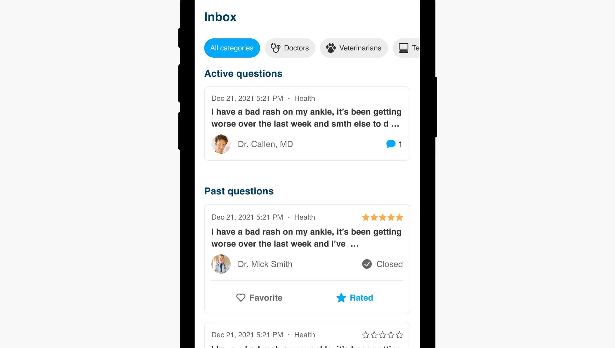
- Past questions moved out. Users only cared about active questions on the home screen, so past questions were moved to a dedicated Inbox tab — reducing page scroll length by 2.5×.
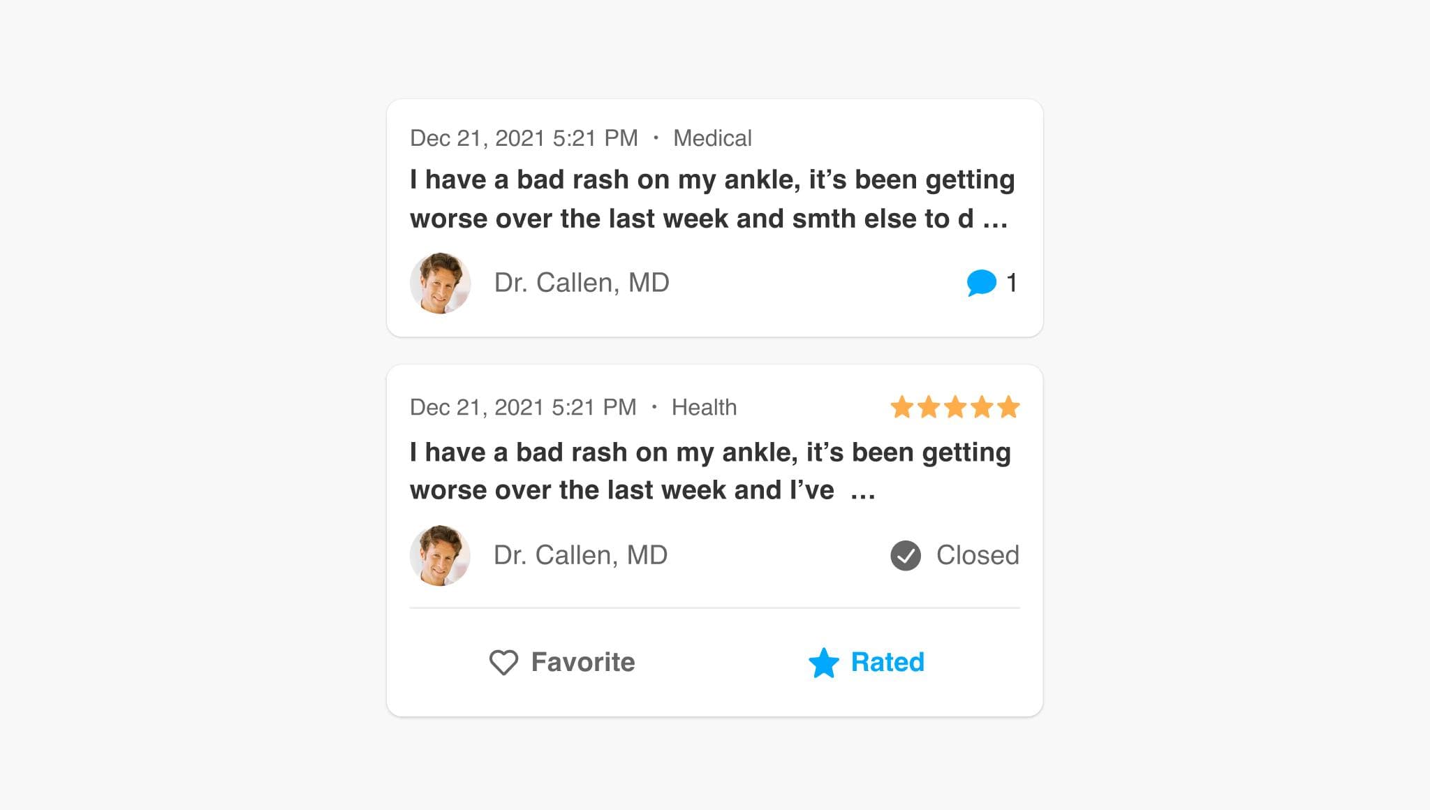
- Smaller question cards. Simplified cards take 3× less vertical space, freeing room for benefits, experts, and category-specific features.
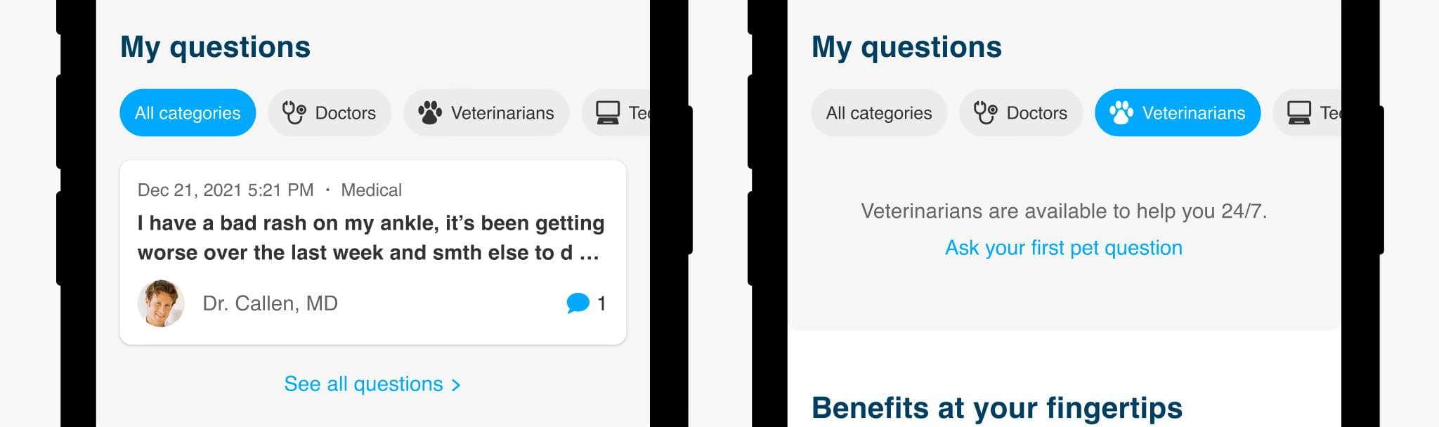
- Category picker added. Research showed users were largely unaware of other expert categories — a filter chip UI surfaced this discovery in a natural way.
User testing
We ran multiple rounds of user testing, iterating on wireframes between sessions. Key learnings:
- The bottom navigation and "Ask now" CTA placement tested very well — users could initiate a new question immediately.
- The category picker effectively educated users about additional expert categories.
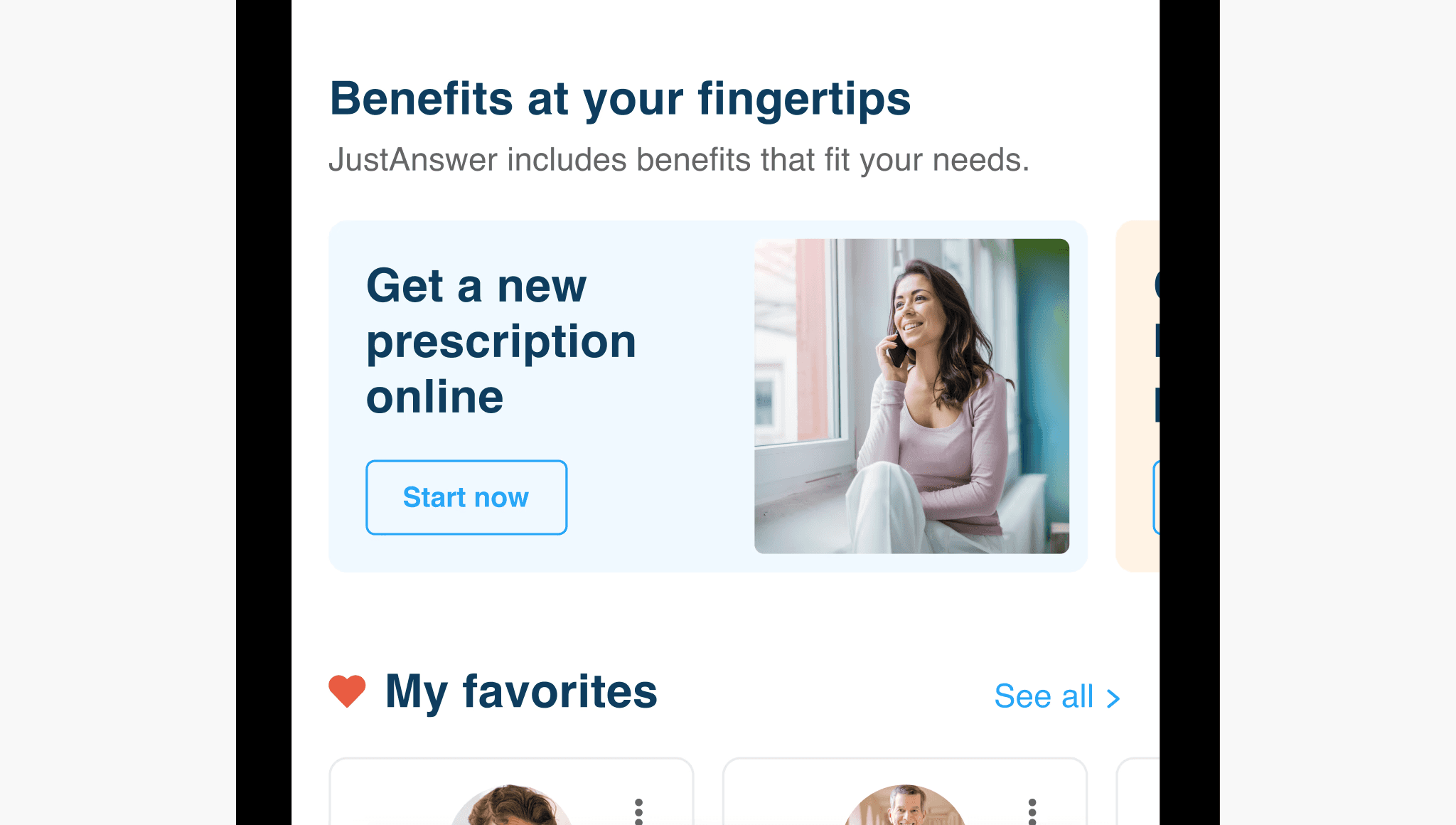
- The benefits section was repeatedly mistaken for advertising. Users felt we were trying to upsell them on something they'd already paid for. We explored several alternative treatments before landing on a design that framed benefits as part of their existing membership.
Final designs
After multiple iteration cycles, we finalized the solution and aligned with leadership before moving to build. The redesign covered five key areas of the dashboard.
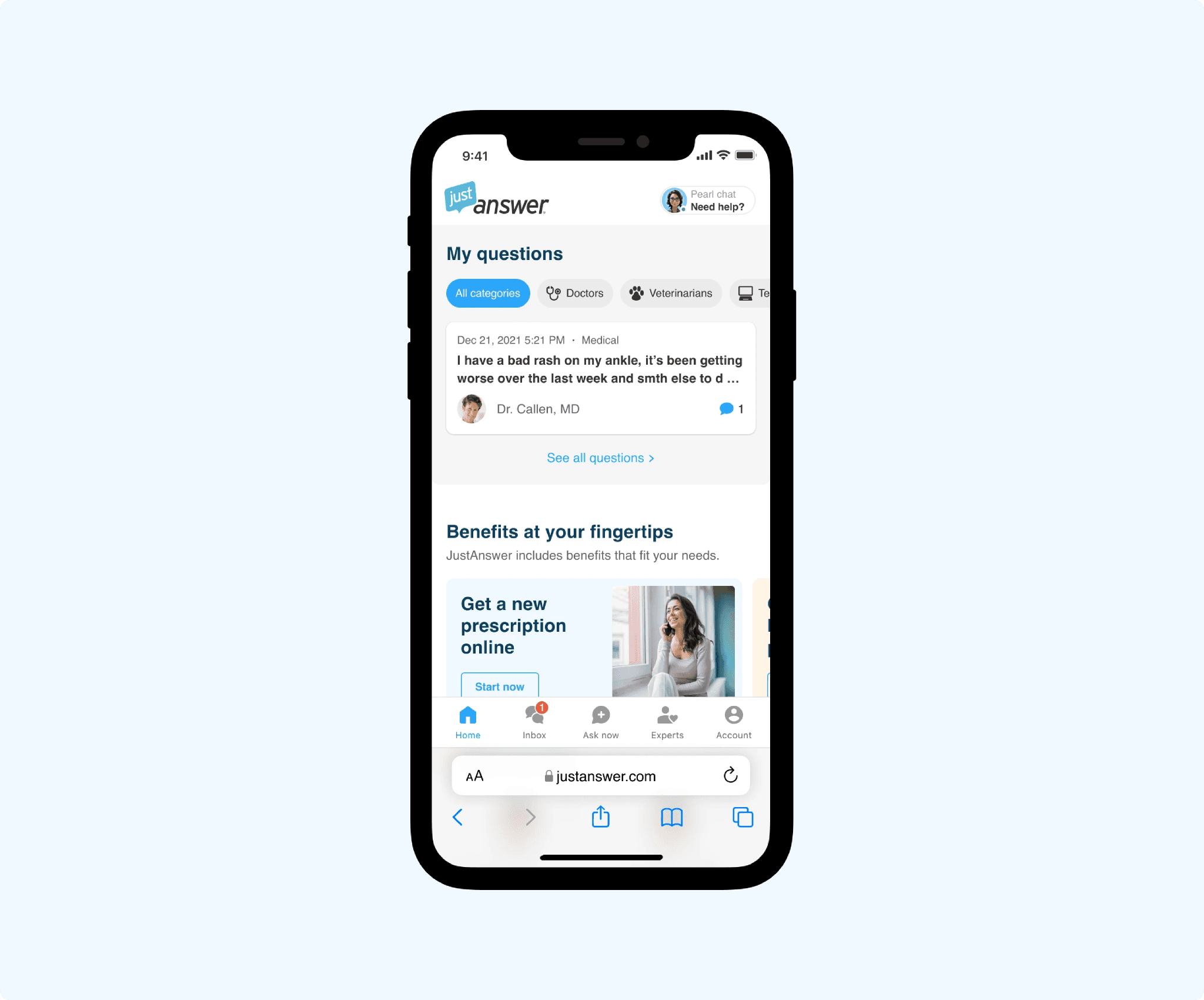
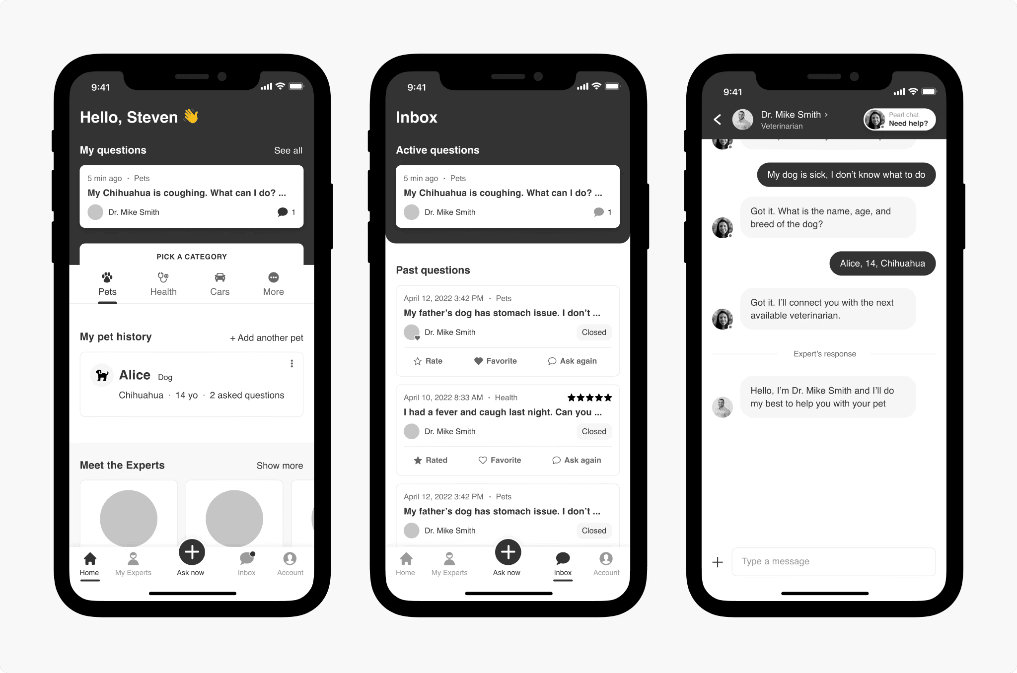
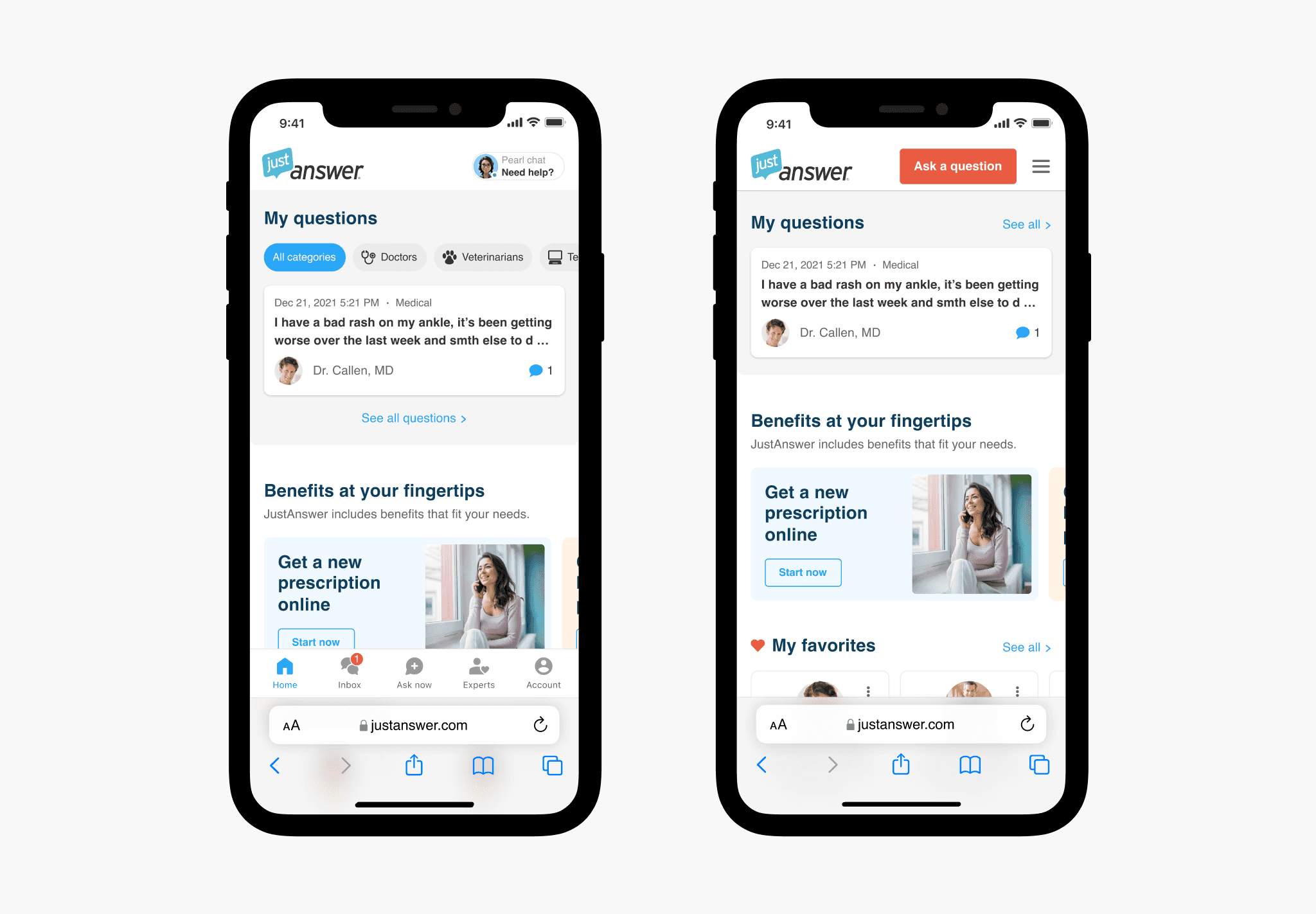
Home page
Cleaner question feed, membership benefits framed as value (not ads), and a personal AI assistant entry point.
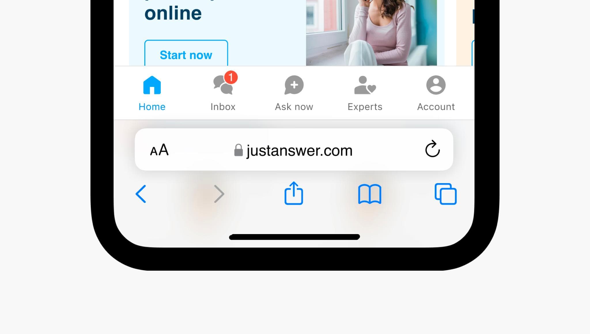
Bottom navigation
Replacing the hamburger menu was the single biggest structural change. The new bottom nav gives users direct access to Home, Inbox, Ask Now, Experts, and Account — making core actions reachable in one tap. Previous questions now live in their own Inbox tab, decluttering the home screen.
Category picker
A horizontal filter chip row lets users browse and filter by expert category directly from the question feed, and doubles as a discovery surface for categories they hadn't previously explored.
Membership benefits
After several rounds of testing, we landed on a card design that clearly communicates benefits as included features — not upsells. This was the version that received the most positive user feedback across all testing rounds.
Personal AI assistant
We introduced an AI assistant entry point on the dashboard as part of the long-term product strategy. The AI assistant had already proven effective in the pre-conversion flow; this extended it into the post-conversion experience for the first time.
Inbox
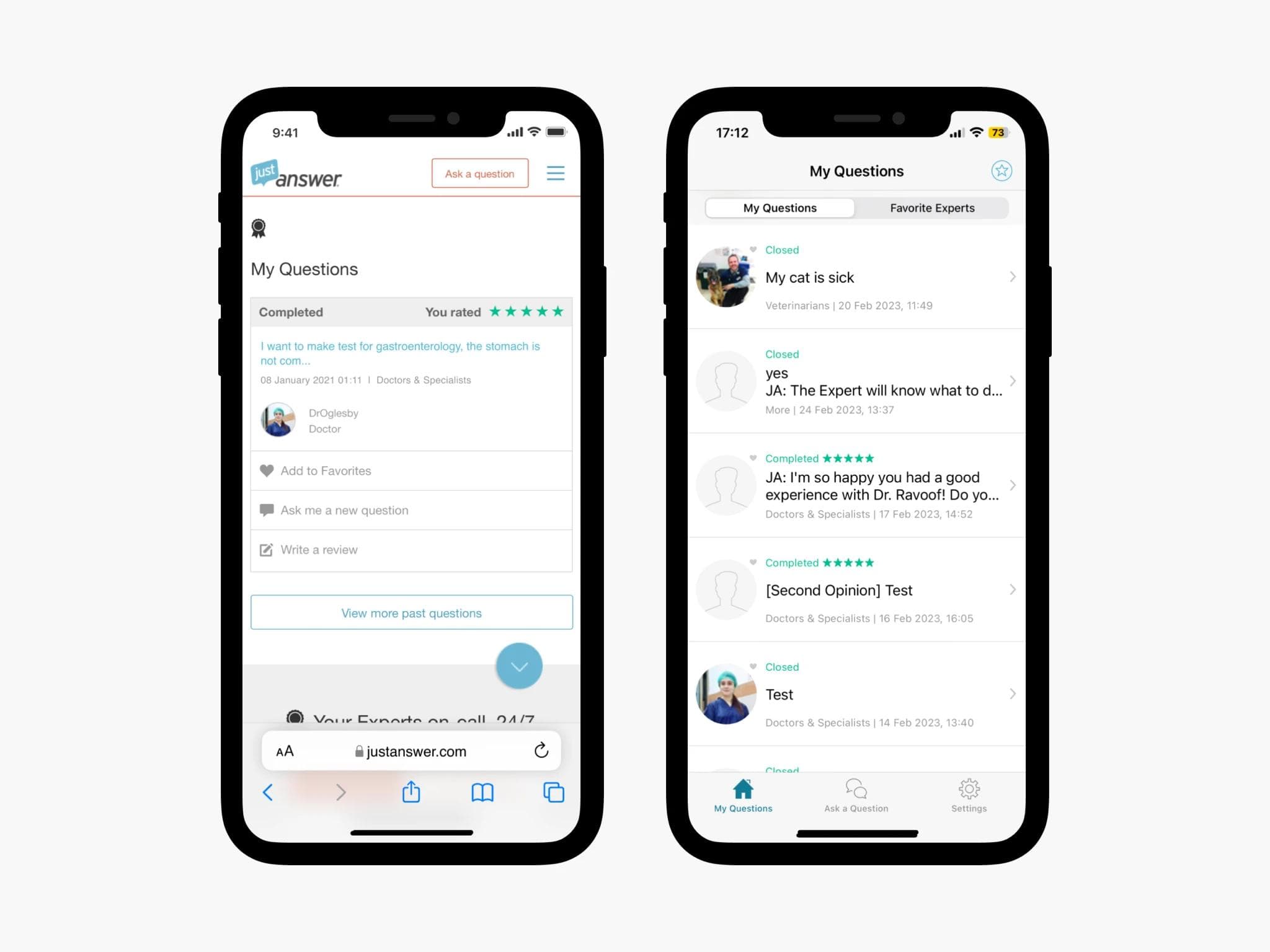
A dedicated tab for all questions — both active and past — filterable by category. Separating this from the home screen was one of the most impactful structural decisions, directly supported by research.
Question cards
Cards were redesigned to surface the most relevant information at a glance: question category, timestamp, expert name and rating, conversation status, expert reply preview, and quick actions (Favorite, Rate).
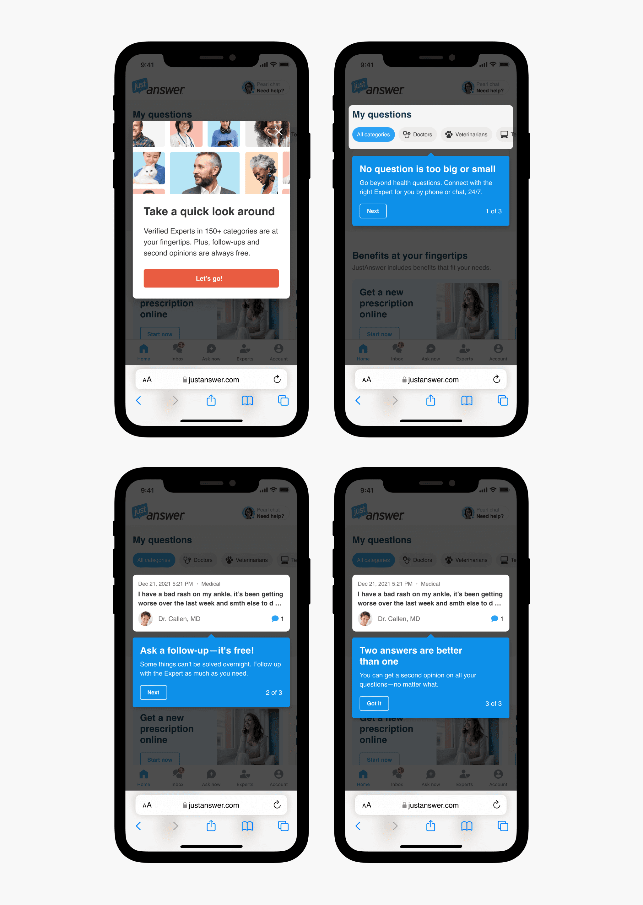
Onboarding
To help existing users understand the new structure and orient new ones, we designed a concise 3-step onboarding flow highlighting the most significant changes.
MVP and prioritization
The full redesign scope was substantial. Rather than shipping everything at once and waiting months for a result, we broke delivery into 4 phases — starting with the highest-impact, lowest-risk changes first.
Phase 1 focused on the mobile web home page redesign, without yet introducing the bottom navigation (which required all downstream pages to also be redesigned). This let us validate the core direction with real users quickly.
A/B test and results
We ran a 50/50 A/B test for 2 months following the Phase 1 release.
+6% LTV35 — improvement in our primary metric
+4% Retention — users staying active longer
−11% Refund rate — fewer users requesting refunds
The results spoke for themselves. We rolled out to all users and moved straight into Phase 2 — bottom navigation and the remaining pages.