FreeConferenceCall
FreeConferenceCall is an online conference call service. It allows users to host an unlimited number of meetings with up to 1,000 participants per meeting.
Problem
FreeConferenceCall's mobile apps were nearly a decade old when I joined. The codebase carried significant legacy constraints, and the UX had not kept pace with user expectations. App Store reviews consistently flagged the same frustrations: too many taps to start a meeting, a confusing navigation structure, and an in-meeting experience limited to just 5 video participants — far below what competing platforms offered.
The COVID period accelerated the urgency. As the user base grew rapidly, it became clear that patching the existing product was not enough. Both platforms needed a strategic overhaul: one that addressed core usability failures and set a technical foundation for long-term sustainability.
Process
I joined after foundational research was done and kicked off my own discovery phase. A UX audit across both platforms revealed 7 separate navigation paths to the same core action — starting or joining a meeting — which became the redesign's north star: consolidate and simplify. A competitive analysis across Zoom, Google Meet, and Teams helped identify where to follow conventions and where FCC could carve its own space. Both informed the navigation structure, host flow, and in-meeting viewing modes.
Redesign
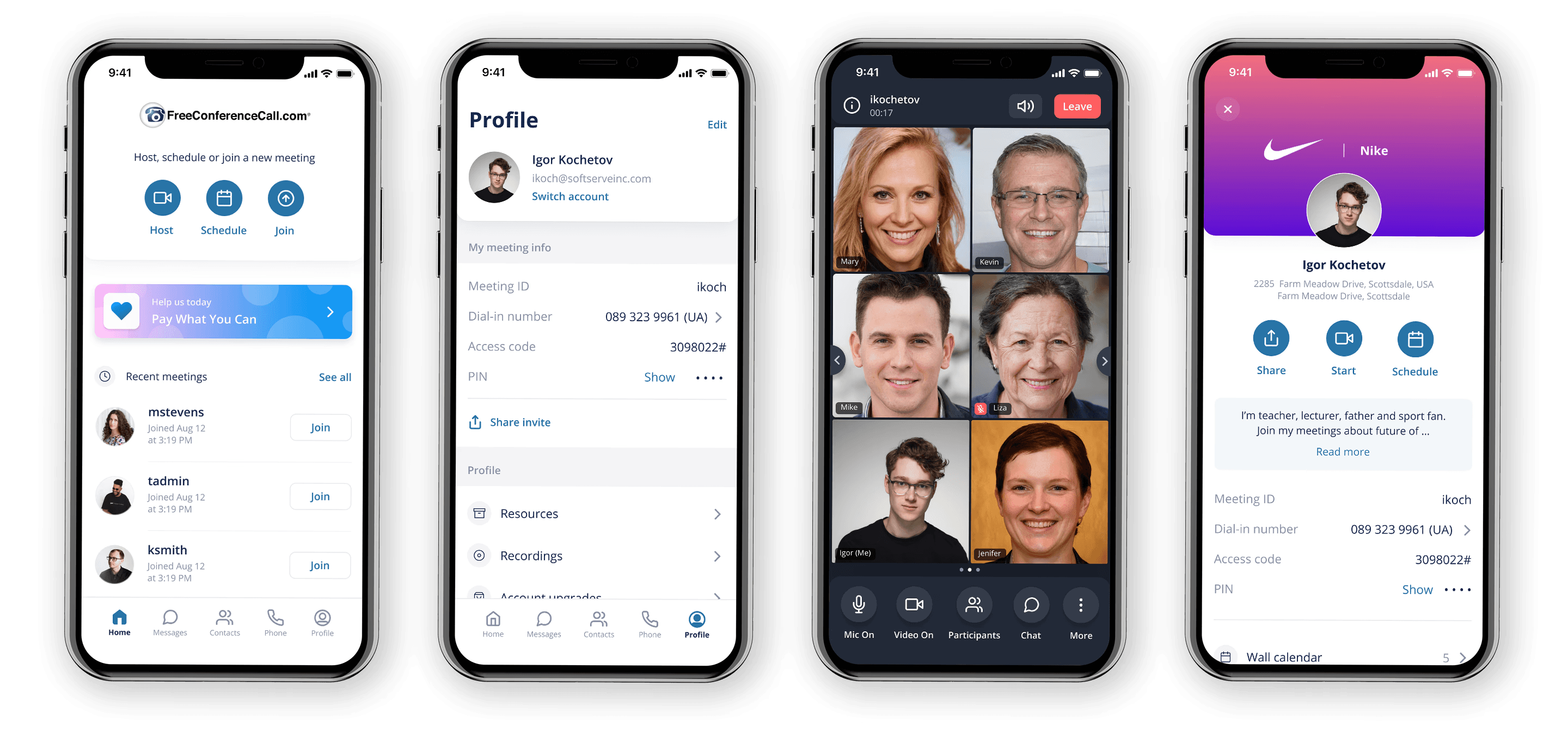
Home page and global navigation
One of the key constraints from the product side was maintaining alignment with the existing company brand guidelines. Within that framework, the primary focus of the redesign was to rethink the information architecture and bring all critical actions within a single tap.
The goal was to streamline the core experience, minimizing the time and cognitive effort required for users to start or join meetings, whether initiating a new session or returning to a recent one. This meant prioritizing speed, clarity, and accessibility across the most frequent user flows.
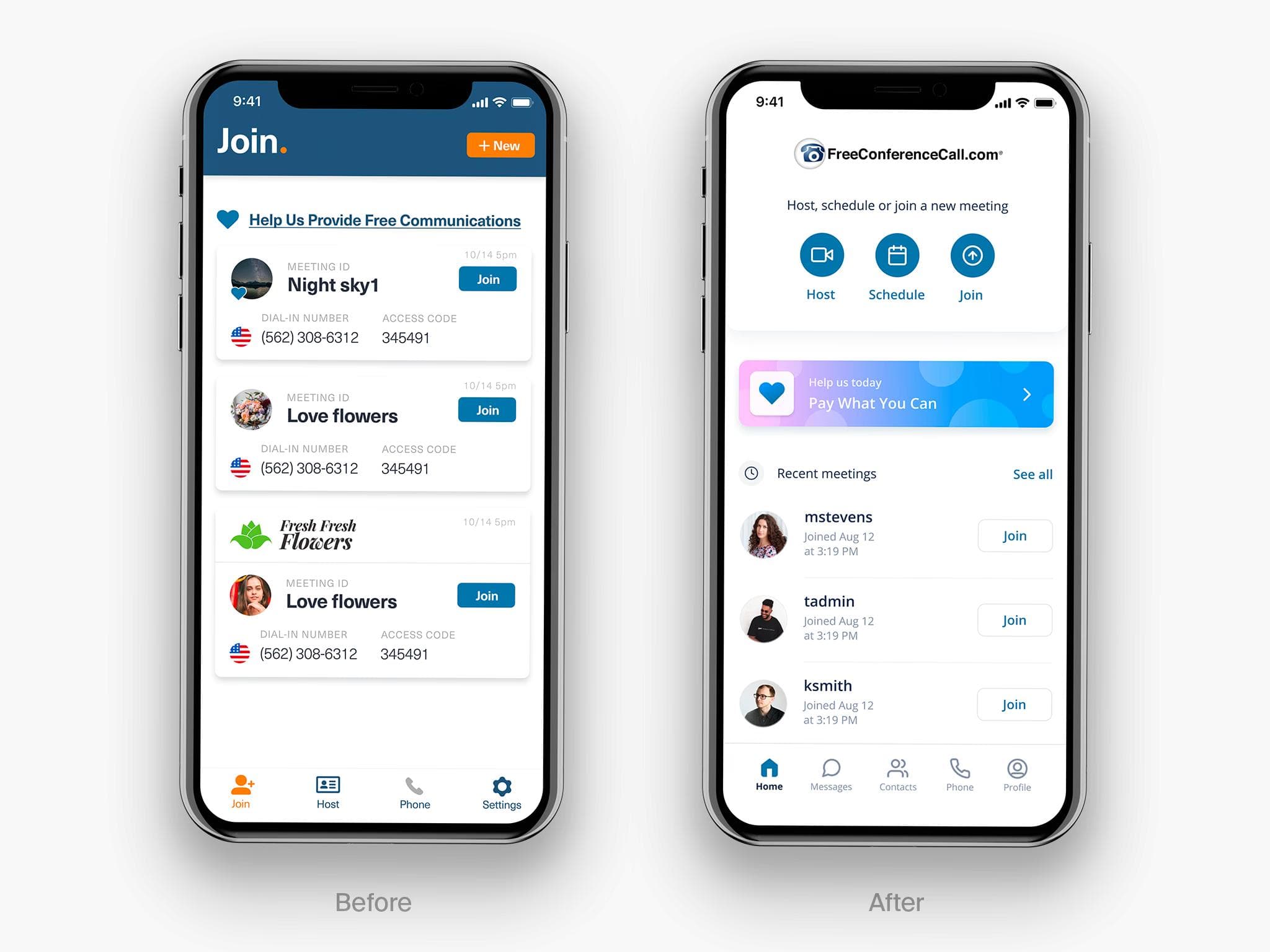
Before
Navigation in the legacy application was fragmented and often unintuitive. Core actions like starting or joining a meeting required switching between multiple tabs, creating unnecessary friction. Additionally, the user profile was buried within the Host section, making it difficult for many users to locate.
After
With the redesigned navigation, we centralized key actions: Host, Join, and Schedule on the home screen. We also simplified recent meeting cards to reduce noise and keep users focused on the most relevant information.
Key pre-meeting screens
We defined two core experience layers: pre-meeting and in-meeting. For the pre-meeting experience, we redesigned key areas including Home, Messages, Contacts, Phone, and Profile.
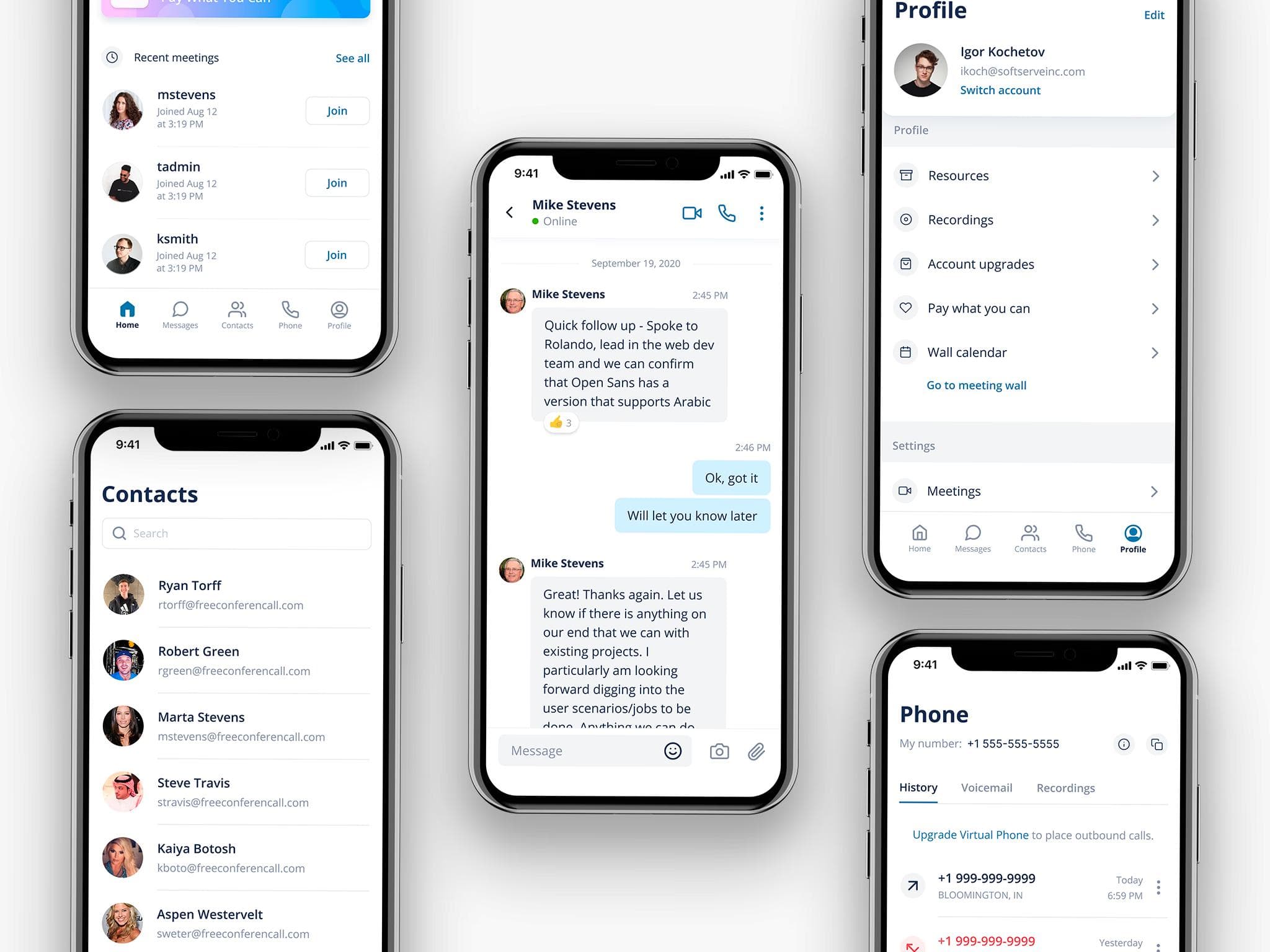
Messages
Messaging is one of the most heavily used areas of the product, so we prioritized a deep redesign, addressing key usability issues and introducing new features to improve the overall experience.
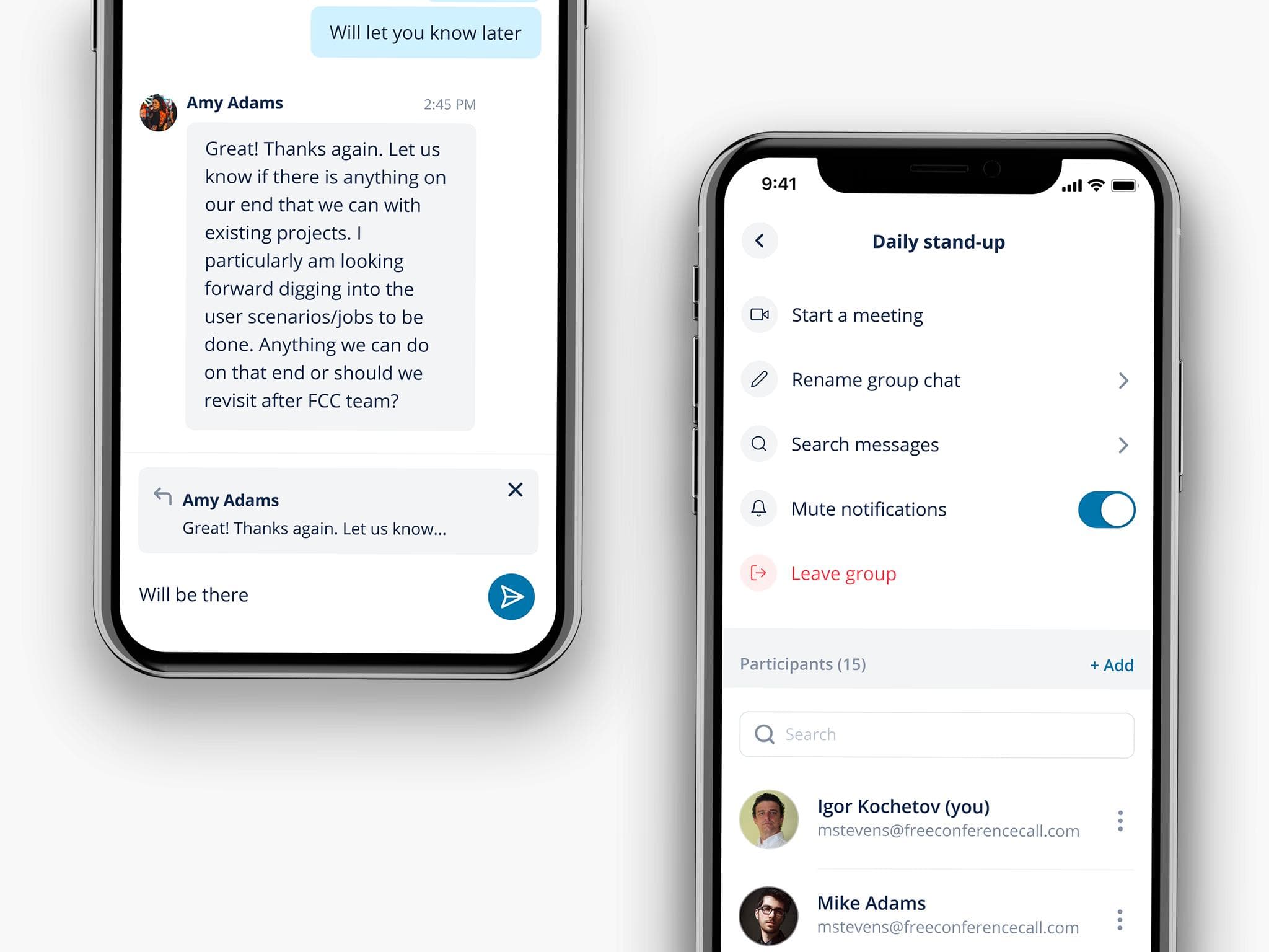
Reactions
Reactions were introduced as a new chat feature, allowing users to respond to specific messages with a long press and select a reaction from a bottom sheet. The same interaction also provides access to additional message actions.
Reactions details
After a reaction is added, it appears directly on the message, and users can tap it to view who has reacted.

Replies
Users can reply by swiping a message, which surfaces a preview of the quoted content in the input field—helping ensure they’re responding to the right message.
Chat details
Tapping on the chat name opens a dedicated details view, where users can access additional actions such as renaming the chat, managing participants, searching messages, and muting the conversation.
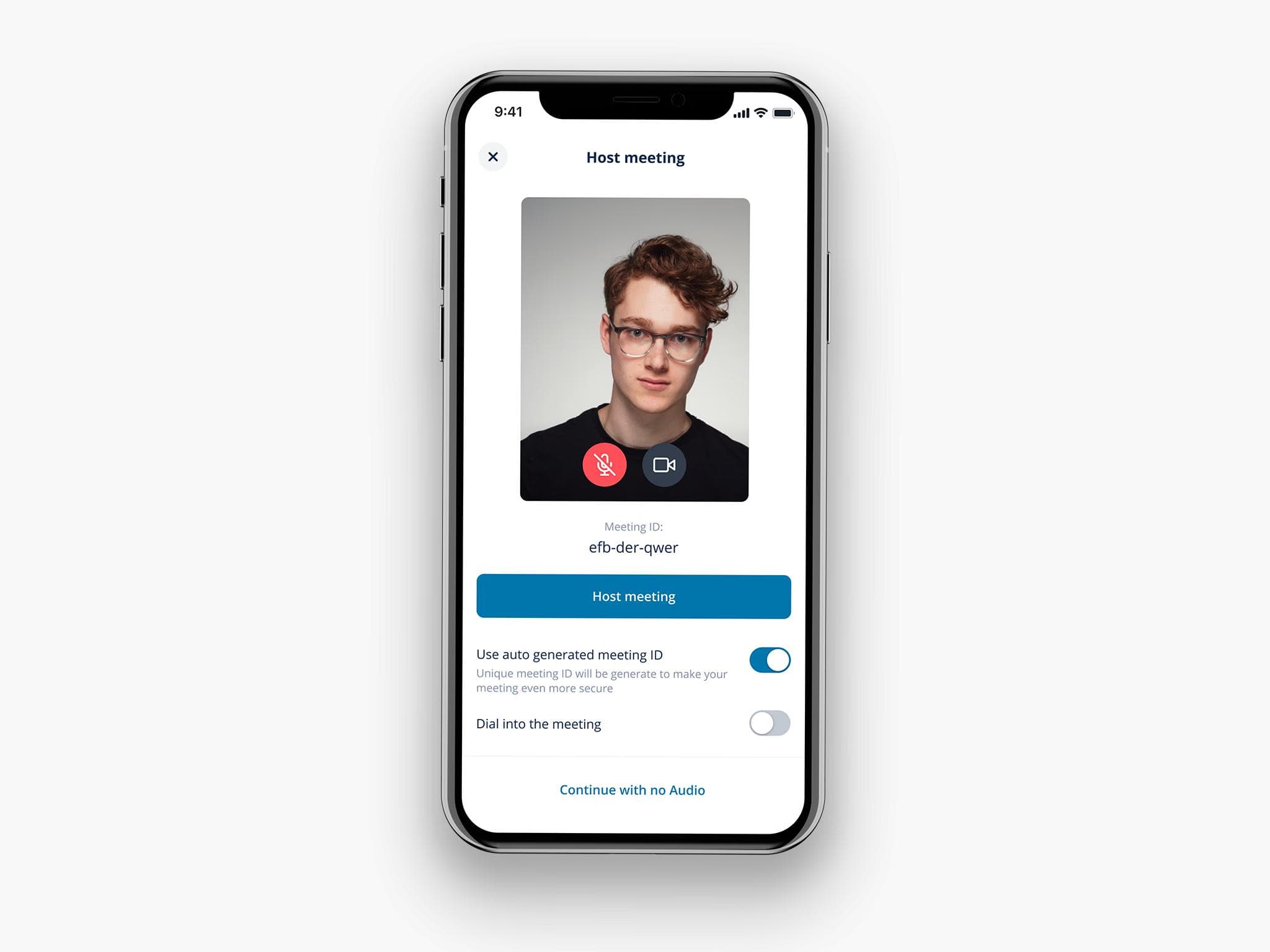
Host meeting
In the legacy experience, starting or joining a meeting required a three-step flow. We streamlined this into a single screen, making the process faster and more straightforward.
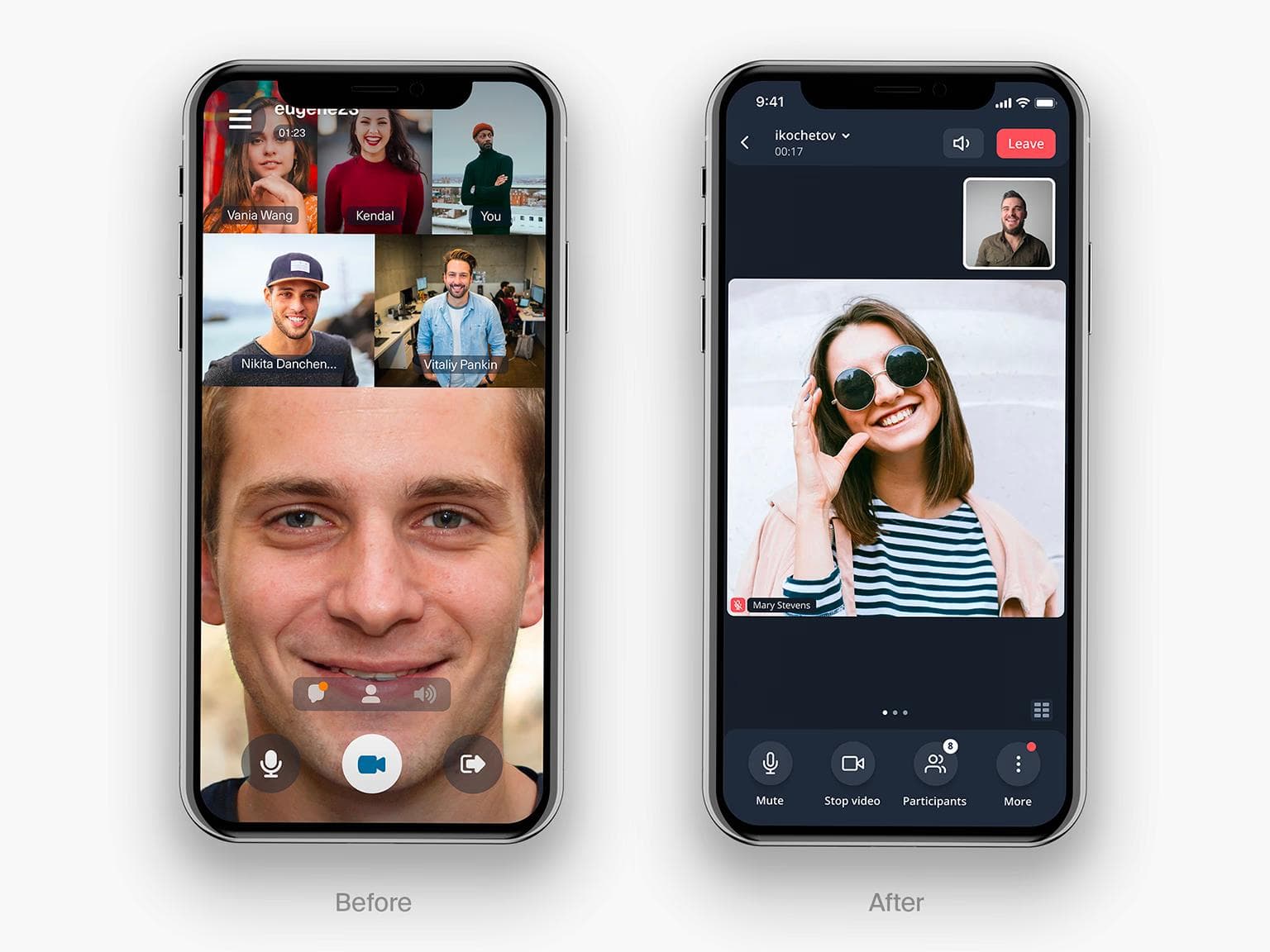
In-meeting experience
The in-meeting experience required the most attention, as it was heavily constrained by technical limitations and received the majority of negative feedback in app store reviews. The previous version supported only five video participants, which significantly impacted usability.
In the redesigned experience, we increased capacity to up to 20 active video streams and introduced two viewing modes—Active Speaker and Gallery—allowing users to switch seamlessly based on their needs.
Active speaker view and Gallery view
Active Speaker view
The default entry point to a meeting is the Active Speaker view, designed to keep the focus on whoever is currently speaking or presenting. The bottom bar surfaces the most frequently used controls: Microphone, Video, Participants, and Chat for quick access.
Gallery view
Users can seamlessly switch to Gallery view—either by swiping left or tapping the icon in the bottom-right corner to see multiple participants at once.

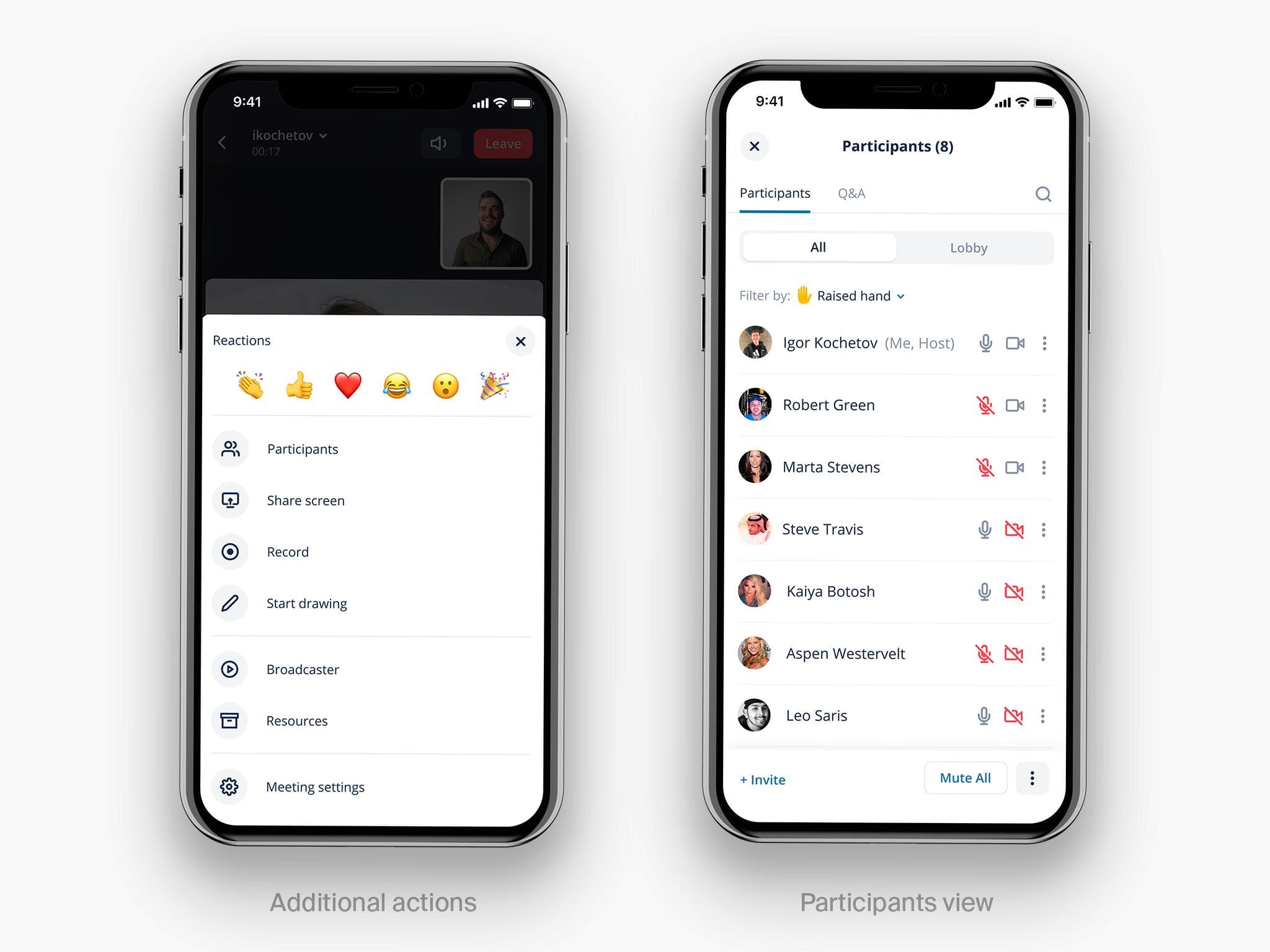
Additional actions & Participants
Users can access extended meeting controls via the “More” button, which opens an overlay with all available features, including quick reactions.
The Participants section was also restructured to prioritize key actions, making the most important controls accessible in a single tap, while secondary options are grouped under an additional menu.
In-meeting guidelines
I created detailed, implementation-ready documentation for the in-meeting experience, covering a wide range of scenarios, from different screen sizes and participant counts to layout variations with and without controls. I also defined key interaction patterns to ensure consistency and high-quality execution across the product.

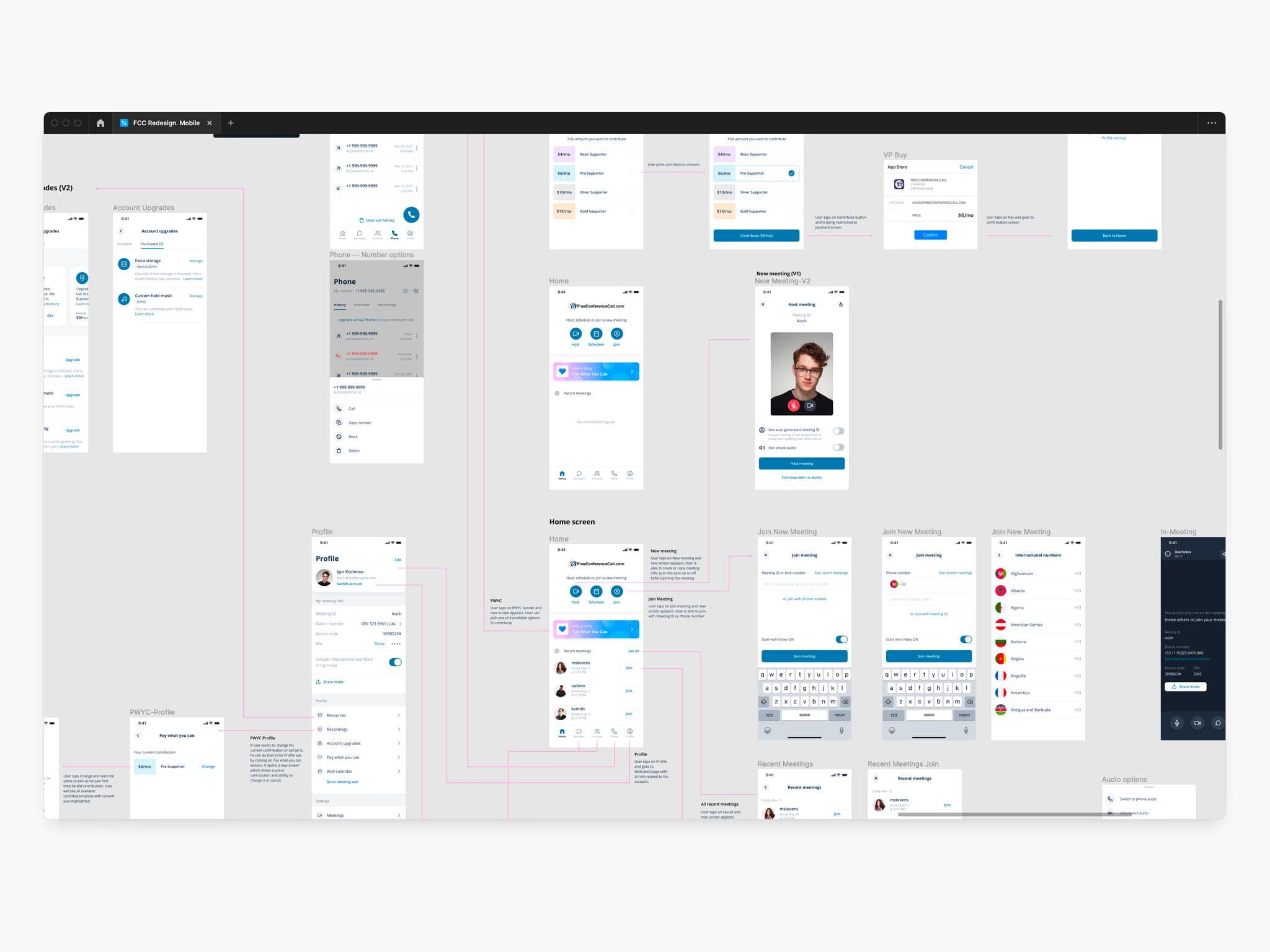
Flows
I also delivered detailed flow diagrams outlining key user journeys and core interaction paths.
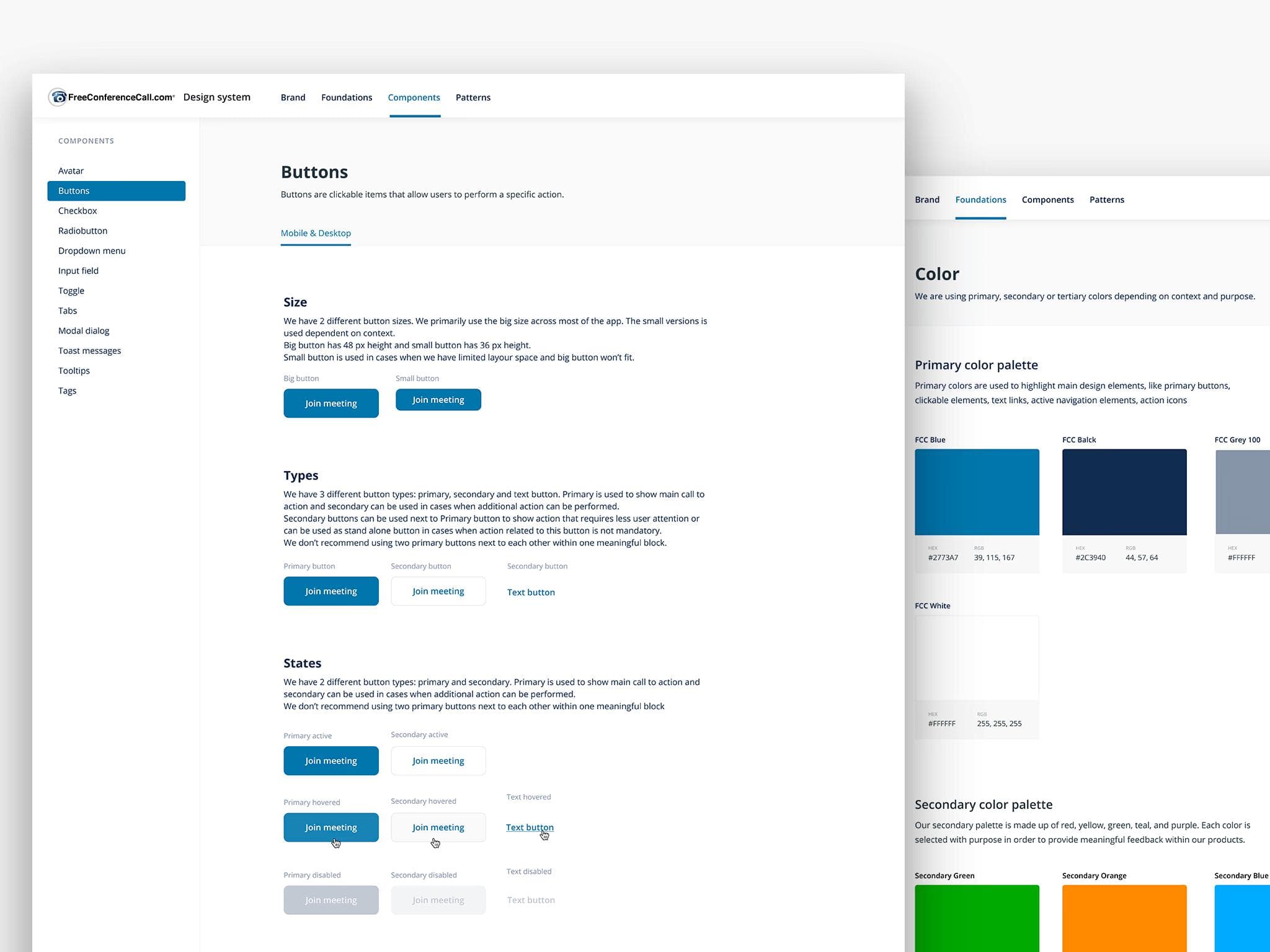
FCC design system
The design system was built in parallel with the product work, not added at the end. It covers Mobile and Desktop with a full component library — buttons, inputs, toggles, modals, and more — each documented with states, sizing rules, and usage guidelines, backed by a consistent color token structure. Beyond components, the system also codifies interaction patterns, ensuring consistent behavior across the product, not just consistent visuals. It continues to be actively used by the team today, supporting faster iteration and more consistent development across new features.
Result
iOS App Store rating: +0.4 pts within the first three months of launch.
Over the course of a year, I led the redesign of FreeConferenceCall across iOS and Android — from initial audit through shipped product — managing a team of 3 designers and working in close partnership with product and engineering.
Prior to launch, we ran moderated usability testing and iterated on key issues identified in those sessions. The initial release shipped as an MVP, with features rolled out incrementally — which helped us validate decisions early and course-correct based on real user behavior.
Within the first few months, user sentiment shifted noticeably across both app stores. The iOS rating improvement was the clearest signal: users who had previously cited navigation confusion and in-meeting limitations as core complaints began leaving markedly more positive reviews after the update.
Beyond the product itself, the design system we built continues to serve the team — reducing design and development time for new features and ensuring a consistent experience as the product grows.