Role
Was a lead designer of the product redesign and led a team of 3 designers. Established brand new design system, performed user testing, and worked closely with product managers and engineers.
Year
2020-2021
Problem
I joined the project to lead a redesign of an existing mobile and desktop apps. They both were designed and developed almost 10 years ago and had a lot of legacy code and usability issues.
As the user base started growing rapidly during the time of Covid, mobile and desktop apps required a quick update both from the usability perspective and technical side.
Process
By the time I joined the project, the product team has already conducted user research and had a clear roadmap for upcoming improvements and new features.I’ve started by analyzing the current state of the app. Looked into the existing information architecture, key user journeys, and primary pain points the product team wanted to focus on. I also spent an enormous time looking at the competitors and analyzing the main patterns among conferencing apps. That was an important exercise to follow best practices among conferencing apps in case the user switches to FCC.
Redesign
Home page and global navigation
The major requirement from the product side was to stick with existing company brand guidelines. The first goal for the redesign was to rethink the app information architecture and keep all the primary actions within one tap. We wanted to reduce the time user spends on hosting or joining either a new meeting or a recent one.
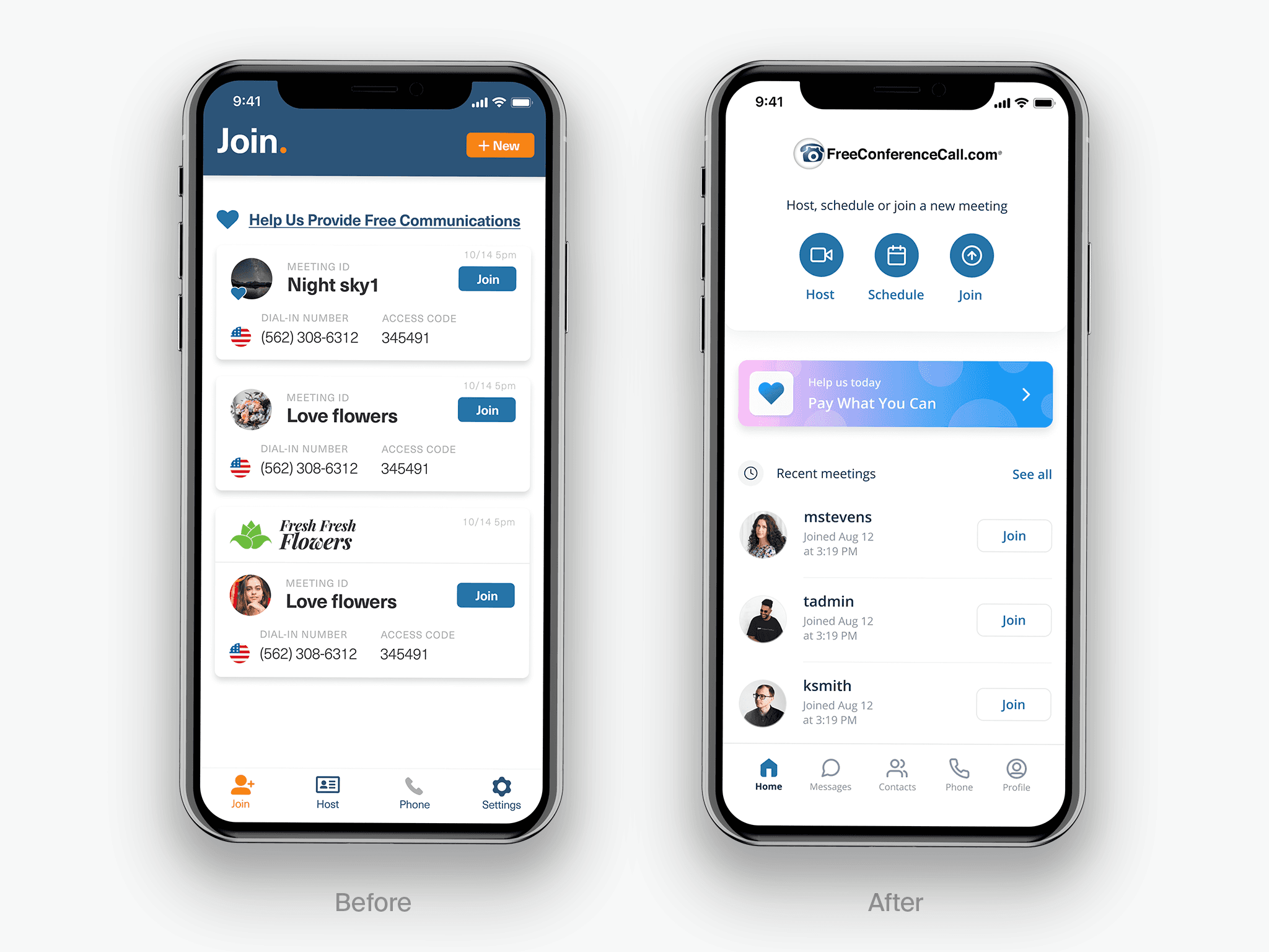
Before
Navigation in the legacy application was tangled and in some ways random. If users want to join/start a new meeting they have to switch between different tabs. The user profile was hidden in the Host section and most users couldn't find it.
After
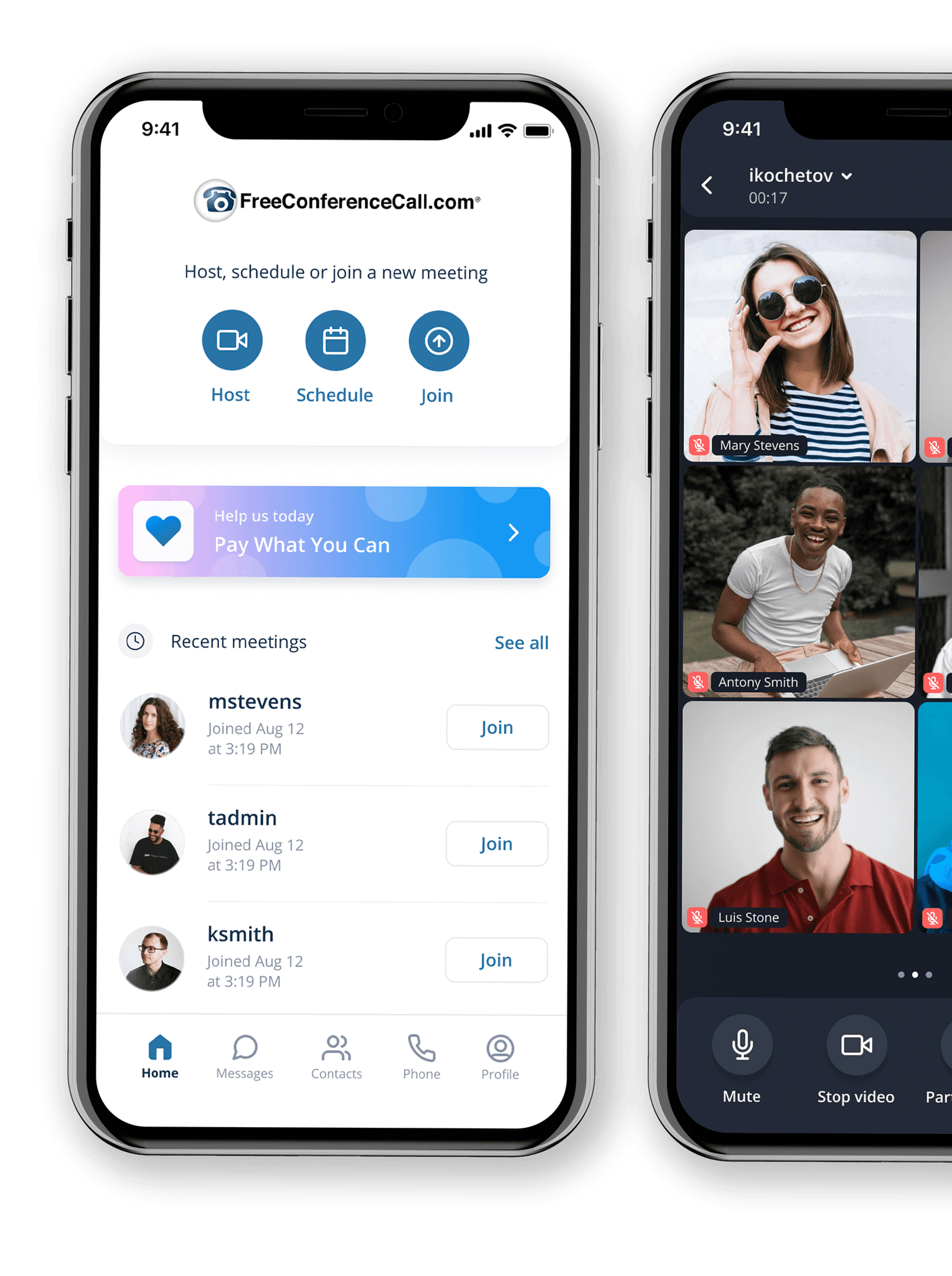
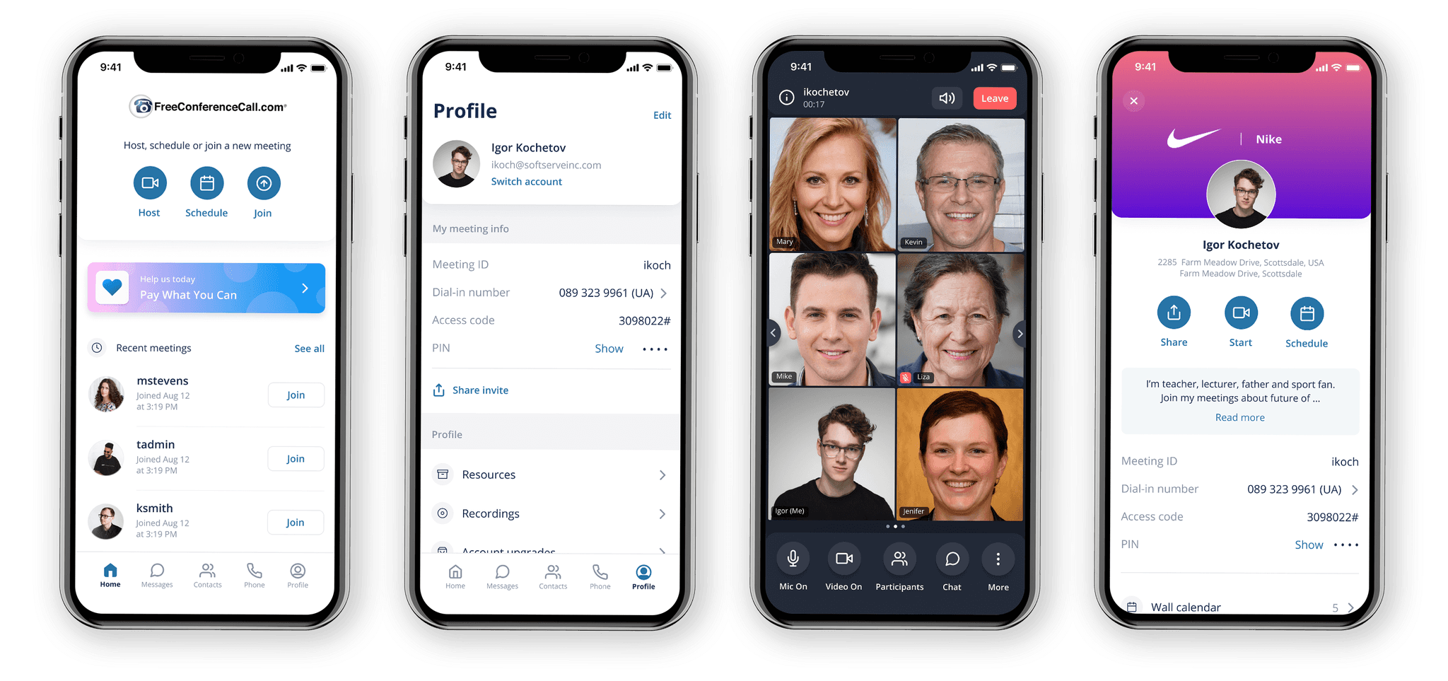
With new navigation, we brought all primary actions like Host, Join and Schedule into the home screen. We also simplified recent meeting cards as much as possible, so users won't be destructed with redundant information.
Key pre-meeting screens
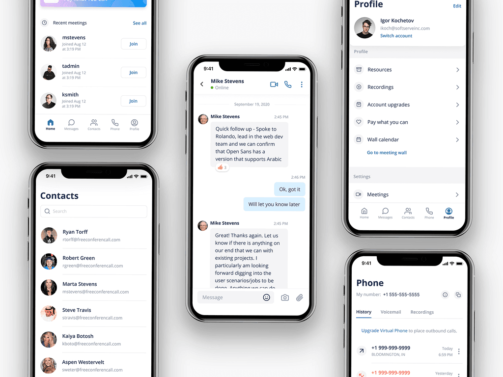
Overall, we defined two key user experience parts in the app: pre-meeting experience and in-meeting. For the pre-meeting experience, we redesigned the Home, Messages, Contacts, Phone, and Profile sections.
Messages
The messages section is one of the most used features in the application. So we spent plenty of time redesigning messaging functionality, fixing existing usability issues, and adding new features.
Reactions
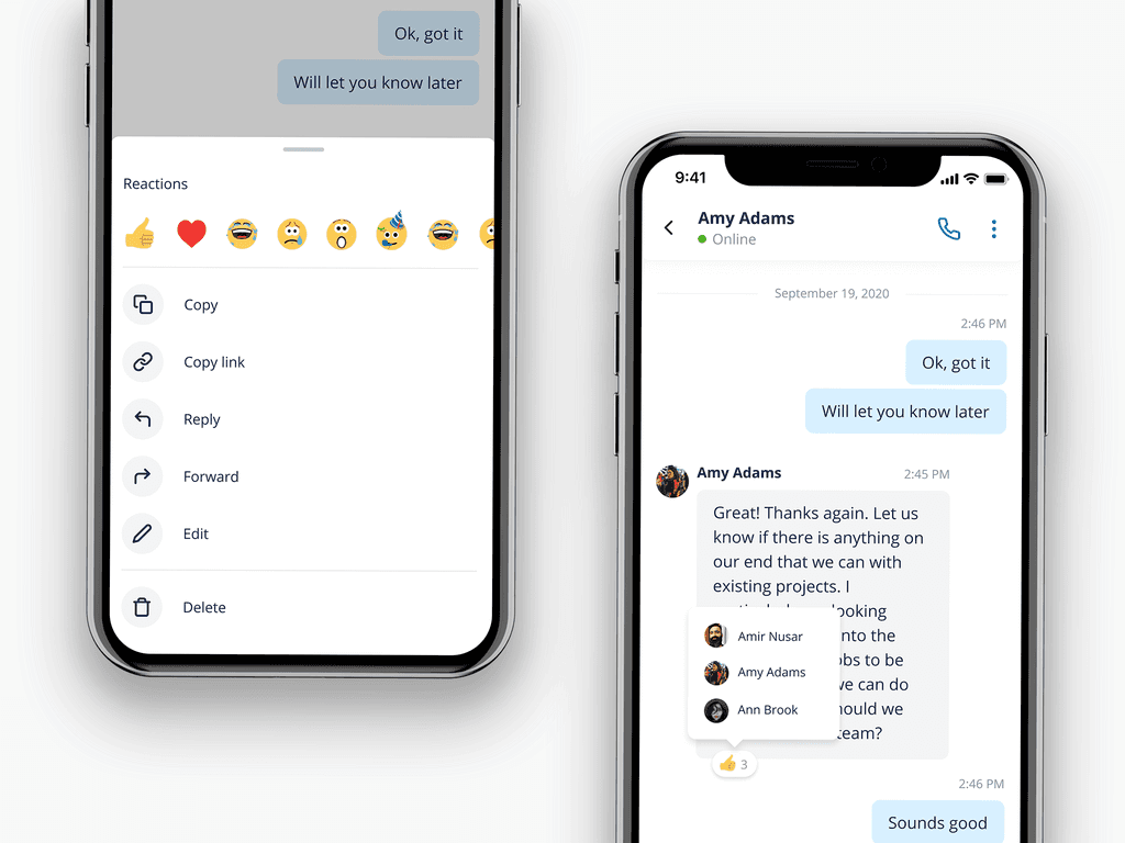
Reactions was one of the new features added to the chat. Now users are able to react to a specific message with a long tap and pick a reaction from the bottom sheet. Under the reactions, users have access to other additional actions.
Reactions details
Once the user reacted to the specific message, the reaction appears over the message and the user is able to tap on it to see who reacted.
Reply
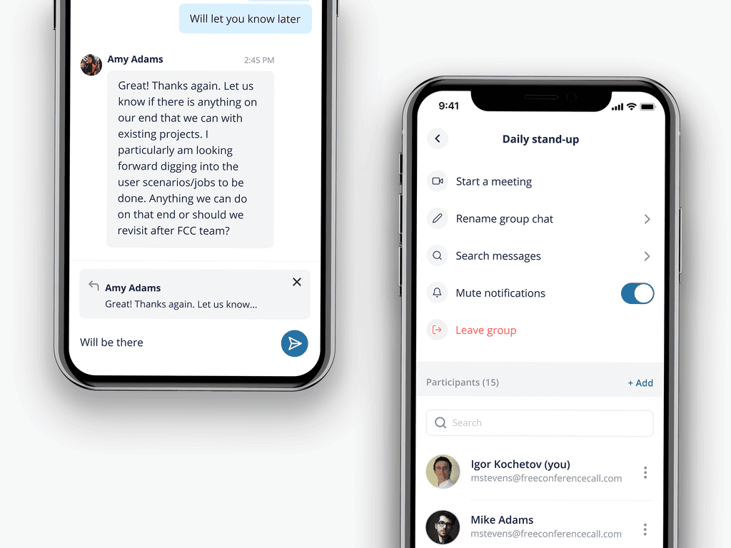
Users can reply by swapping the message. The preview of the quoted message will appear in a text area, so users can be sure that they reply to the right message
Chat details
If the user wants to see additional chat details they can just tap on the chat name. That would open a dedicated page with all the additional features like changing the chat name, managing chat participants, searching for specific messages, muting the cat, etc.
Host meeting
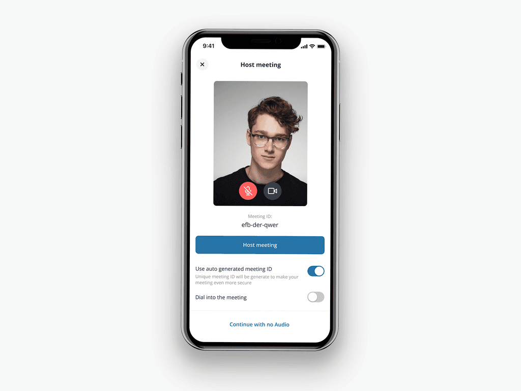
In the old version of the app in order to Join or Host a meeting users had to go through three steps flow. We managed to simplify this flow into one screen and in that way make the process of hosting the meeting more faster and straightforward.
In-meeting experience
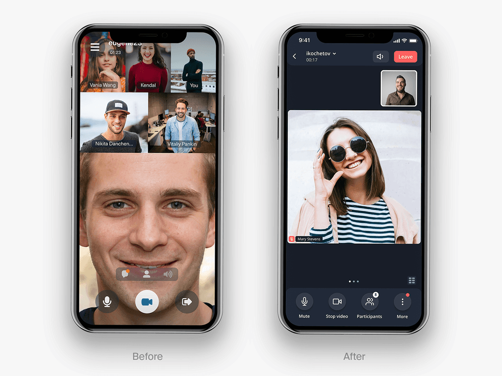
The in-meeting experience was the one that need the attention the most. The original app was limited only to 5 video slots due to technical limitations. The usability of this screen was the one that had the most negative feedback on AppStore and Playmarket.
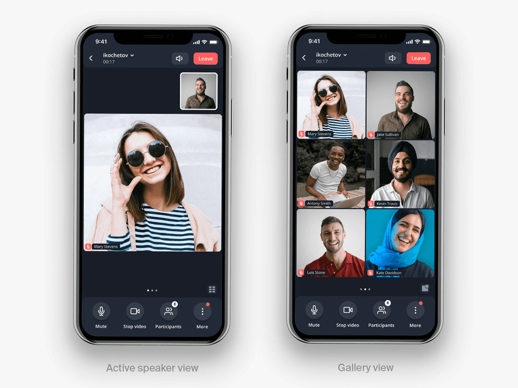
The new app is now allowed to have up to 20 active video slots per meeting. Now the user has two views: active speaker view and gallery view and can switch between those two.
Active speaker view and Gallery view
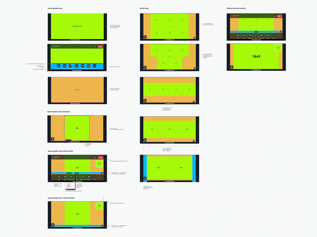
Active speaker view. The default view once the user enters the meeting is the active speaker view. That helps the user to focus on the person who is currently speaking or presenting. The bottom bar includes the most used features such as Microphone, Video, Participants, and Chat.
Gallery view. From the active speaker view user can quickly switch to the gallery view by swapping left or tapping on the icon bottom right corner.
Additional actions and Participants view
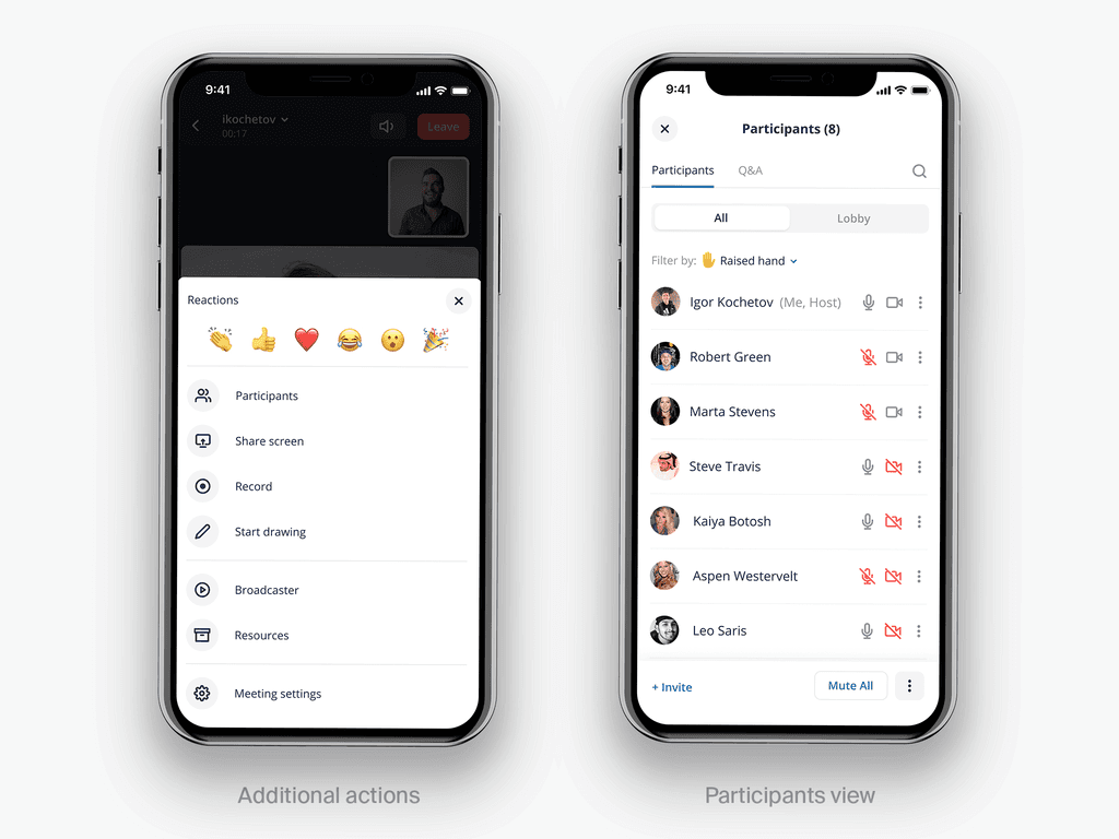
Users also have access to the additional meeting actions. By tapping on the More button user will see an overlay with a list of all available features including quick reactions.
Participants. This section has also been completely reorganized, so users can have quick access to the most important features just with one tap. Other features were hidden under the additional menu.
In-meeting guidelines
The design team worked hard to provide the most detailed documentation to the dev team for the new design of the in-meeting experience. We had to consider different use cases, screen sizes, the number of video slots displayed, view with or without the controls, and different interaction nuances.
Flows
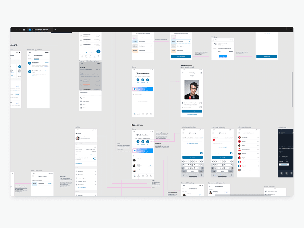
We also provided detailed diagrams with the main flows and user journeys
FCC design system
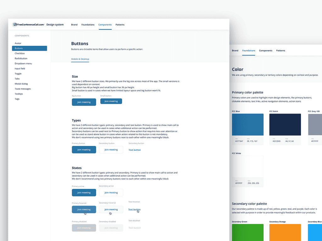
Another important part of this project was to establish a design system that would support both design and dev teams. We wanted to achieve consistency in the design between different parts of the app. As well as we wanted to simplify and speed up the development process by having shared components and reusing them when it's possible.
Result
I've spent more than 1 year working on FreeConferenceCall app redesign. I led a team of 3 other designers and established a good collaboration between the product and dev teams. In close collaboration, we managed to release both iOS and Android apps. Before the launch, we ran a couple of moderated usability user tests and fixed some usability issues based on user feedback.
The first release was an MVP and some features were missing but nonetheless, after a couple of months of the new version running we already noticed a positive customers feedback shift both on the AppStore and Google Play market. The iOS rating went up by 0,4 points in the first 3 months after the release.
Also, as a result, we had a well-established design system that would help the team to design and implement new features in the future in a more convenient way.
Overall, a better user experience and improved app functionality with the support of new technology approach allowed us to increase app adoption, improve rating and expand user base.


